
Marketing
Jan 24, 2025
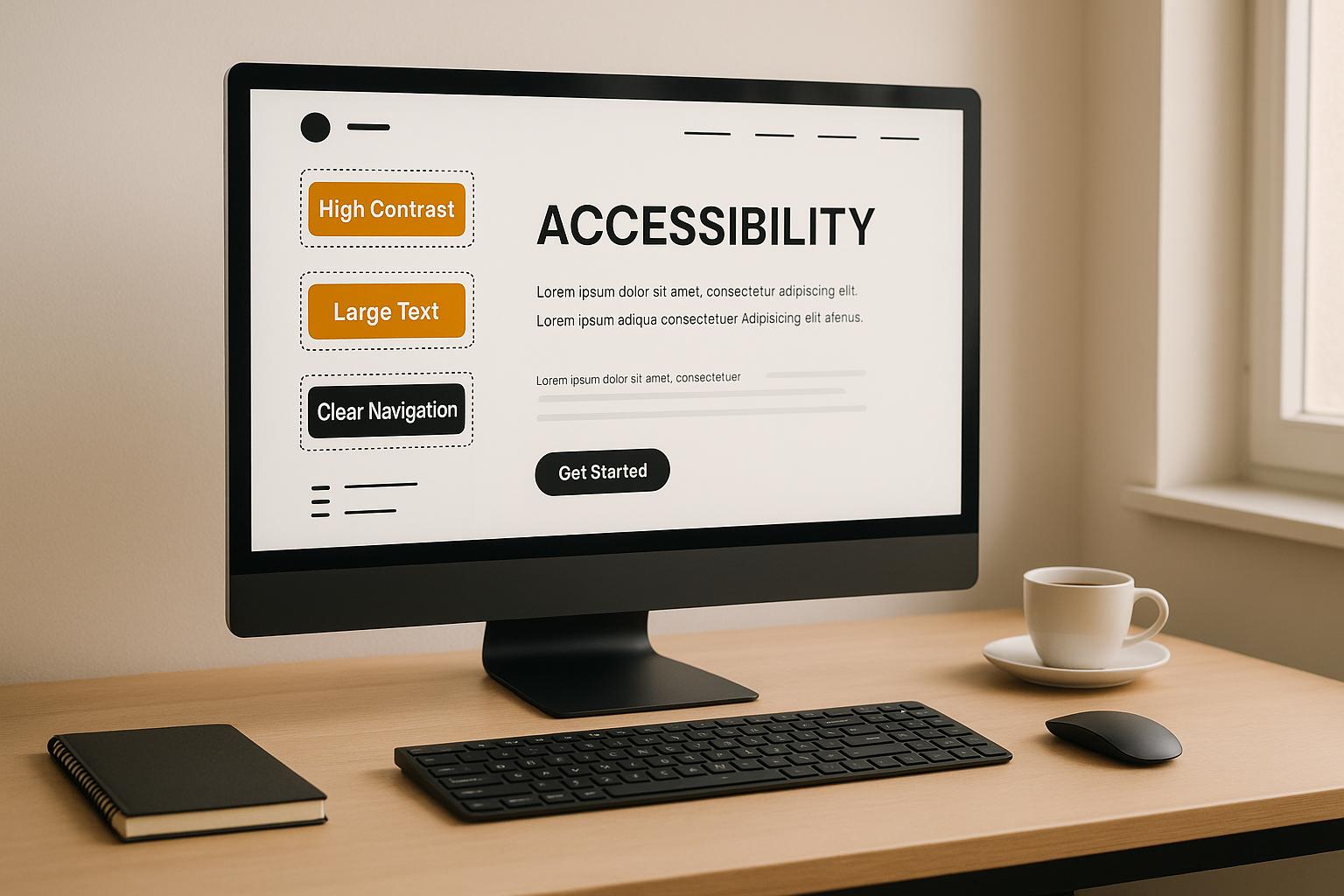
Accessibility in design systems matters more than ever. It ensures usability for everyone, reduces legal risks, and boosts business performance. Poor accessibility can lead to lawsuits, user frustration, and lost opportunities. Fixing issues early saves costs and improves user satisfaction.
Key Accessibility Challenges:
Color Contrast: Low contrast makes text unreadable.
Keyboard Navigation: Missing or broken keyboard support limits usability.
ARIA Misuse: Incorrect roles confuse assistive technologies.
Forms: Poor labeling and error handling block user tasks.
Why Accessibility Pays Off:
35% less rework in development.
22% market reach increase.
34% higher user retention.
27% faster task completion.
Takeaway: Start with WCAG 2.2 standards, use tools like contrast checkers and automated tests, and update design system docs regularly. Accessibility isn’t just compliance - it’s good business.
Auditing design systems for accessibility - Anna Cook (Config 2021)
4 Major Accessibility Problems in Design Systems
Creating accessible design systems often comes with its own set of challenges. Here, we’ll dive into four common issues that can hinder accessibility and usability.
Poor Color Contrast
When color contrast is too low, it becomes harder for users to read text or interact with components. This is especially problematic for individuals with visual impairments or for anyone trying to view content in bright lighting conditions. Following established accessibility standards, like the Web Content Accessibility Guidelines (WCAG), can help ensure text and interface elements remain easy to see and use.
Broken Keyboard Navigation
Keyboard navigation is a lifeline for many users, including those with mobility impairments. When this feature isn’t properly supported - whether through missing focus indicators or focus traps - users can struggle to navigate interfaces effectively. This not only slows them down but can also prevent them from completing essential tasks.
Incorrect ARIA Usage
ARIA (Accessible Rich Internet Applications) attributes play a vital role in helping assistive technologies, like screen readers, interpret an interface. But when ARIA attributes are misused or applied incorrectly, they can create confusion and make navigation more difficult for users relying on these tools. Proper implementation is key to maintaining accessibility.
Inaccessible Forms
Forms are a critical part of many online experiences, from signing up for services to completing purchases. However, forms can become a significant barrier when they lack clear labels, effective error messages, or proper focus management. These shortcomings can leave users frustrated and unable to complete their tasks.
How to Fix Common Accessibility Issues
This section provides practical solutions for the accessibility challenges discussed earlier.
Meeting Color Contrast Standards
Low color contrast remains a widespread issue, with 83.6% of websites falling short in this area. To address this:
Leverage design tokens: Use tools like the Design Token Generator to ensure predefined contrast ratios.
Test color combinations: Tools such as WebAIM's Contrast Checker or the Stark plugin for Figma can help verify compliance.
Follow WCAG standards: Maintain a minimum contrast ratio of 4.5:1 for regular text and 3:1 for user interface components.
For instance, Dynatrace's design system enforces consistent contrast by applying tokenized values across its interface, ensuring accessibility throughout.
Once color contrast is in check, the next step is improving keyboard navigation.
Building Better Keyboard Navigation
Keyboard accessibility is crucial, yet 25% of screen reader users report difficulties with keyboard navigation. Following Microsoft's keyboard UI guidelines can help:
Arrow keys: Use for navigating within components.
Tab key: Reserve for moving between major elements.
Ctrl+Tab: Apply for switching between panels in complex interfaces.
For components like carousels, implement a roving tabindex and use proper ARIA attributes. Danielle Favreau's design system overhaul is a great example - she established a sequential focus order and added visible focus indicators, greatly improving accessibility compliance.
Using ARIA the Right Way
Misusing ARIA can create more problems than it solves. In fact, pages with improper ARIA usage show 41% more accessibility errors. Here’s how to use ARIA effectively:
Common Issue | Solution | Benefit |
|---|---|---|
Redundant roles | Stick to native HTML elements | Reduces confusion for screen readers |
Missing relationships | Define parent-child connections | Enhances navigational context |
Incorrect live regions | Use appropriate aria-live values | Ensures timely updates for users |
Careful ARIA implementation ensures smoother interactions for assistive technology users.
Creating Accessible Forms
Forms are another area where accessibility often falls short. In 2024, 35.8% of form inputs were found to lack proper labeling. To improve form accessibility:
Clear Labeling
Always use explicit HTML labels with matchingforattributes. Avoid relying solely on aria-label, as it can be less effective for screen readers.Effective Error Handling
Use attributes likearia-invalidandaria-describedbyto link error messages to specific fields. Place error text directly below the input field for clarity.Keyboard Operability
Ensure a logical tab order by structuring HTML appropriately. All interactive elements should be fully operable via keyboard, with visible focus indicators meeting contrast requirements.
For example, if an email input is invalid, display a message like “Invalid email format” immediately below the field. Link this message using aria-describedby (e.g., aria-describedby="email-error") so screen readers can communicate the error effectively.
While automated tools can identify 20–30% of WCAG issues, manual testing using screen readers like NVDA or VoiceOver is essential for thorough validation.
Adding Accessibility Rules to Design System Docs
Accessibility standards are the backbone of any design system's documentation. Research shows that teams resolve accessibility issues 73% faster when comprehensive guidelines are in place.
Keeping Accessibility Standards Updated
The BBC's design system serves as a great example, detailing elements like focus order and screen reader announcements for complex components. This level of specificity ensures that developers and designers are aligned on accessibility expectations.
To create effective documentation, include component-specific guidance on ARIA patterns, color contrast requirements, keyboard navigation flows, and screen reader interactions. For instance, the Australian Government Design System uses a changelog to flag components that need updates whenever new WCAG criteria are introduced.
Real-world results back up the value of this approach. A Razorpay accessibility lead reported a 40% reduction in accessibility-related tickets within six months of implementing quarterly reviews and automated monitoring.
Example Documentation Structure
Section | Required Content | Update Frequency |
|---|---|---|
Technical Specs | ARIA patterns and keyboard behaviors | Monthly |
Testing Guides | Screen reader test cases and outcomes | Quarterly |
Compliance Status | WCAG conformance level and known issues | Bi-weekly |
Migration Notes | Breaking changes and upgrade paths | As needed |
By updating guidelines regularly, teams can also lay the groundwork for automated accessibility validation.
Setting Up Automated Tests
Automated testing can identify up to 80% of accessibility issues before production. When integrated into CI/CD pipelines, these tests can cut remediation costs by 60–80% compared to fixing issues after launch.
A robust automated testing framework often includes tools like:
axe DevTools for validating individual components
Pa11y for ensuring cross-component consistency
Jest-axe for unit testing accessibility requirements
Microsoft's Accessibility Insights provides pre-built test cases that teams can embed directly into their documentation, bridging the gap between documented standards and real-world implementation.
For a more holistic approach, UXPin's prototype testing environment generates detailed reports highlighting:
Color contrast issues
Keyboard navigation flaws
ARIA implementation errors
Inaccessible form fields
To prevent accessibility drift, teams can also set up automated regression tests for documentation examples. The BBC iPlayer team, for instance, reduced regression issues by 30% after introducing automated email digests for critical updates.
While automated tests are powerful, pairing them with manual reviews ensures that context-specific challenges are addressed effectively.
Conclusion: Next Steps for Better Accessibility
Tackling accessibility challenges head-on is essential, but sustaining those improvements requires thoughtful planning and action. Starting accessibility efforts early in the design process can significantly cut costs. For instance, accessible design systems have been shown to reduce remediation expenses by 67% when issues are addressed upfront. US Bank provides a compelling example, saving $6.1 million annually by integrating accessibility considerations earlier in their workflows.
Real-world examples highlight the effectiveness of proactive strategies. The Dutch government's NL Design System offers a standout case study, cutting WCAG failures by 89% over 18 months through a structured three-tier approach. This method combines automated testing, expert evaluations, and community feedback to deliver measurable results.
Other organizations have also reaped the benefits of prioritizing accessibility. Bank of America’s improvements to accessible forms resulted in annual savings of $2.1 million. Meanwhile, Microsoft's Fluent System overhaul led to a 34% boost in task completion rates for users with low vision.
Key Success Metrics
Metric | Industry Average | Best-in-Class Results |
|---|---|---|
Bug Resolution Speed | 40–60% faster | 72% reduction in 6 months |
Screen Reader Navigation | Standard baseline | 58% faster completion |
Form Error Rates | Industry standard | 41% reduction |
Advancements in technology are further simplifying accessibility improvements. Tools like AI-powered contrast checkers and voice-enabled prototypes are streamlining compliance testing. Smart component libraries, which adapt to user preferences, are making it easier to create inclusive designs.
Additionally, there’s a clear business case for accessibility. Forrester research reveals that accessible digital platforms achieve 23% higher customer satisfaction (CSAT) scores. With forms and menus accounting for 78% of user interactions, focusing on these high-impact areas can yield substantial benefits. Regular accessibility audits and detailed documentation are crucial for maintaining these gains over time.
Looking ahead, accessibility is more than just a compliance requirement - it’s a commitment to inclusivity. With the European Accessibility Act set to take effect in June 2025, organizations that embed accessibility into their design systems will not only meet legal standards but also position themselves as leaders in creating better digital experiences. By making accessibility a core principle, businesses can ensure long-term success while fostering a more inclusive digital world.
FAQs
How can I ensure keyboard navigation is accessible in a design system?
Ensuring Keyboard Navigation Accessibility in Design Systems
Creating an accessible design system means paying close attention to keyboard navigation. Here are a few key steps to get it right:
Establish a logical focus order: Interactive elements should follow a sequence that aligns with the visual and contextual flow of the page. Use semantic HTML and proper ARIA roles to guide this process.
Make focus indicators visible: Buttons, links, and other interactive elements need clear focus indicators - like outlines or highlights - that stand out and are easy to spot.
Implement standard keyboard interactions: Ensure users can navigate with familiar shortcuts, such as
Tabto move through elements andEnterorSpaceto activate them.Prevent keyboard traps: Components like modals or dropdowns should allow users to exit easily using keys like
Esc, ensuring they don’t get stuck.
By following these practices, you can design systems that are more accessible and user-friendly. If you're looking for expert guidance, Offlens Studio specializes in helping founders and entrepreneurs build accessible, high-quality digital products.
How can businesses evaluate the impact of improved accessibility on performance and user satisfaction?
Measuring the Impact of Improved Accessibility
To gauge how well your accessibility improvements are working, it's essential to use a mix of numbers and personal feedback. Start by looking at key metrics like conversion rates, bounce rates, and time spent on site. These numbers can reveal how user behavior changes after making your site more accessible. Tools like analytics platforms are great for tracking these trends and identifying patterns.
But don’t stop there - hearing directly from users is just as important. Conduct surveys, interviews, or usability tests with people who depend on accessibility features. Their feedback can give you a clearer picture of how these changes improve their overall experience. By combining hard data with real user insights, you’ll have a complete view of how effective your efforts truly are.
Why are regular documentation updates important for maintaining accessibility in design systems?
Why Regularly Updating Documentation Matters for Accessibility
Keeping your documentation up to date is a crucial step in ensuring your design system consistently meets accessibility standards. Accessibility guidelines and best practices are not static - they evolve over time. If your documentation lags behind, it can result in inconsistencies or even critical accessibility issues slipping through the cracks.
When documentation reflects the latest standards, it helps teams stay aligned on current requirements, making workflows more efficient. Plus, it ensures that every component in your system remains inclusive, serving users with a wide range of needs. This isn't just about usability; it's about showing a genuine commitment to building digital experiences that are fair and accessible to everyone.
Related posts
10 Common UI/UX Mistakes Startups Make (And How to Fix Them)
5 Ways to Speed Up Your Design-to-Development Workflow
How to Add Dark Mode to Webflow Projects
Top 7 Tips for Learning Webflow or Framer
Marketing
Jan 25, 2025
Accessibility in design systems matters more than ever. It ensures usability for everyone, reduces legal risks, and boosts business performance. Poor accessibility can lead to lawsuits, user frustration, and lost opportunities. Fixing issues early saves costs and improves user satisfaction.
Key Accessibility Challenges:
Color Contrast: Low contrast makes text unreadable.
Keyboard Navigation: Missing or broken keyboard support limits usability.
ARIA Misuse: Incorrect roles confuse assistive technologies.
Forms: Poor labeling and error handling block user tasks.
Why Accessibility Pays Off:
35% less rework in development.
22% market reach increase.
34% higher user retention.
27% faster task completion.
Takeaway: Start with WCAG 2.2 standards, use tools like contrast checkers and automated tests, and update design system docs regularly. Accessibility isn’t just compliance - it’s good business.
Auditing design systems for accessibility - Anna Cook (Config 2021)
4 Major Accessibility Problems in Design Systems
Creating accessible design systems often comes with its own set of challenges. Here, we’ll dive into four common issues that can hinder accessibility and usability.
Poor Color Contrast
When color contrast is too low, it becomes harder for users to read text or interact with components. This is especially problematic for individuals with visual impairments or for anyone trying to view content in bright lighting conditions. Following established accessibility standards, like the Web Content Accessibility Guidelines (WCAG), can help ensure text and interface elements remain easy to see and use.
Broken Keyboard Navigation
Keyboard navigation is a lifeline for many users, including those with mobility impairments. When this feature isn’t properly supported - whether through missing focus indicators or focus traps - users can struggle to navigate interfaces effectively. This not only slows them down but can also prevent them from completing essential tasks.
Incorrect ARIA Usage
ARIA (Accessible Rich Internet Applications) attributes play a vital role in helping assistive technologies, like screen readers, interpret an interface. But when ARIA attributes are misused or applied incorrectly, they can create confusion and make navigation more difficult for users relying on these tools. Proper implementation is key to maintaining accessibility.
Inaccessible Forms
Forms are a critical part of many online experiences, from signing up for services to completing purchases. However, forms can become a significant barrier when they lack clear labels, effective error messages, or proper focus management. These shortcomings can leave users frustrated and unable to complete their tasks.
How to Fix Common Accessibility Issues
This section provides practical solutions for the accessibility challenges discussed earlier.
Meeting Color Contrast Standards
Low color contrast remains a widespread issue, with 83.6% of websites falling short in this area. To address this:
Leverage design tokens: Use tools like the Design Token Generator to ensure predefined contrast ratios.
Test color combinations: Tools such as WebAIM's Contrast Checker or the Stark plugin for Figma can help verify compliance.
Follow WCAG standards: Maintain a minimum contrast ratio of 4.5:1 for regular text and 3:1 for user interface components.
For instance, Dynatrace's design system enforces consistent contrast by applying tokenized values across its interface, ensuring accessibility throughout.
Once color contrast is in check, the next step is improving keyboard navigation.
Building Better Keyboard Navigation
Keyboard accessibility is crucial, yet 25% of screen reader users report difficulties with keyboard navigation. Following Microsoft's keyboard UI guidelines can help:
Arrow keys: Use for navigating within components.
Tab key: Reserve for moving between major elements.
Ctrl+Tab: Apply for switching between panels in complex interfaces.
For components like carousels, implement a roving tabindex and use proper ARIA attributes. Danielle Favreau's design system overhaul is a great example - she established a sequential focus order and added visible focus indicators, greatly improving accessibility compliance.
Using ARIA the Right Way
Misusing ARIA can create more problems than it solves. In fact, pages with improper ARIA usage show 41% more accessibility errors. Here’s how to use ARIA effectively:
Common Issue | Solution | Benefit |
|---|---|---|
Redundant roles | Stick to native HTML elements | Reduces confusion for screen readers |
Missing relationships | Define parent-child connections | Enhances navigational context |
Incorrect live regions | Use appropriate aria-live values | Ensures timely updates for users |
Careful ARIA implementation ensures smoother interactions for assistive technology users.
Creating Accessible Forms
Forms are another area where accessibility often falls short. In 2024, 35.8% of form inputs were found to lack proper labeling. To improve form accessibility:
Clear Labeling
Always use explicit HTML labels with matchingforattributes. Avoid relying solely on aria-label, as it can be less effective for screen readers.Effective Error Handling
Use attributes likearia-invalidandaria-describedbyto link error messages to specific fields. Place error text directly below the input field for clarity.Keyboard Operability
Ensure a logical tab order by structuring HTML appropriately. All interactive elements should be fully operable via keyboard, with visible focus indicators meeting contrast requirements.
For example, if an email input is invalid, display a message like “Invalid email format” immediately below the field. Link this message using aria-describedby (e.g., aria-describedby="email-error") so screen readers can communicate the error effectively.
While automated tools can identify 20–30% of WCAG issues, manual testing using screen readers like NVDA or VoiceOver is essential for thorough validation.
Adding Accessibility Rules to Design System Docs
Accessibility standards are the backbone of any design system's documentation. Research shows that teams resolve accessibility issues 73% faster when comprehensive guidelines are in place.
Keeping Accessibility Standards Updated
The BBC's design system serves as a great example, detailing elements like focus order and screen reader announcements for complex components. This level of specificity ensures that developers and designers are aligned on accessibility expectations.
To create effective documentation, include component-specific guidance on ARIA patterns, color contrast requirements, keyboard navigation flows, and screen reader interactions. For instance, the Australian Government Design System uses a changelog to flag components that need updates whenever new WCAG criteria are introduced.
Real-world results back up the value of this approach. A Razorpay accessibility lead reported a 40% reduction in accessibility-related tickets within six months of implementing quarterly reviews and automated monitoring.
Example Documentation Structure
Section | Required Content | Update Frequency |
|---|---|---|
Technical Specs | ARIA patterns and keyboard behaviors | Monthly |
Testing Guides | Screen reader test cases and outcomes | Quarterly |
Compliance Status | WCAG conformance level and known issues | Bi-weekly |
Migration Notes | Breaking changes and upgrade paths | As needed |
By updating guidelines regularly, teams can also lay the groundwork for automated accessibility validation.
Setting Up Automated Tests
Automated testing can identify up to 80% of accessibility issues before production. When integrated into CI/CD pipelines, these tests can cut remediation costs by 60–80% compared to fixing issues after launch.
A robust automated testing framework often includes tools like:
axe DevTools for validating individual components
Pa11y for ensuring cross-component consistency
Jest-axe for unit testing accessibility requirements
Microsoft's Accessibility Insights provides pre-built test cases that teams can embed directly into their documentation, bridging the gap between documented standards and real-world implementation.
For a more holistic approach, UXPin's prototype testing environment generates detailed reports highlighting:
Color contrast issues
Keyboard navigation flaws
ARIA implementation errors
Inaccessible form fields
To prevent accessibility drift, teams can also set up automated regression tests for documentation examples. The BBC iPlayer team, for instance, reduced regression issues by 30% after introducing automated email digests for critical updates.
While automated tests are powerful, pairing them with manual reviews ensures that context-specific challenges are addressed effectively.
Conclusion: Next Steps for Better Accessibility
Tackling accessibility challenges head-on is essential, but sustaining those improvements requires thoughtful planning and action. Starting accessibility efforts early in the design process can significantly cut costs. For instance, accessible design systems have been shown to reduce remediation expenses by 67% when issues are addressed upfront. US Bank provides a compelling example, saving $6.1 million annually by integrating accessibility considerations earlier in their workflows.
Real-world examples highlight the effectiveness of proactive strategies. The Dutch government's NL Design System offers a standout case study, cutting WCAG failures by 89% over 18 months through a structured three-tier approach. This method combines automated testing, expert evaluations, and community feedback to deliver measurable results.
Other organizations have also reaped the benefits of prioritizing accessibility. Bank of America’s improvements to accessible forms resulted in annual savings of $2.1 million. Meanwhile, Microsoft's Fluent System overhaul led to a 34% boost in task completion rates for users with low vision.
Key Success Metrics
Metric | Industry Average | Best-in-Class Results |
|---|---|---|
Bug Resolution Speed | 40–60% faster | 72% reduction in 6 months |
Screen Reader Navigation | Standard baseline | 58% faster completion |
Form Error Rates | Industry standard | 41% reduction |
Advancements in technology are further simplifying accessibility improvements. Tools like AI-powered contrast checkers and voice-enabled prototypes are streamlining compliance testing. Smart component libraries, which adapt to user preferences, are making it easier to create inclusive designs.
Additionally, there’s a clear business case for accessibility. Forrester research reveals that accessible digital platforms achieve 23% higher customer satisfaction (CSAT) scores. With forms and menus accounting for 78% of user interactions, focusing on these high-impact areas can yield substantial benefits. Regular accessibility audits and detailed documentation are crucial for maintaining these gains over time.
Looking ahead, accessibility is more than just a compliance requirement - it’s a commitment to inclusivity. With the European Accessibility Act set to take effect in June 2025, organizations that embed accessibility into their design systems will not only meet legal standards but also position themselves as leaders in creating better digital experiences. By making accessibility a core principle, businesses can ensure long-term success while fostering a more inclusive digital world.
FAQs
How can I ensure keyboard navigation is accessible in a design system?
Ensuring Keyboard Navigation Accessibility in Design Systems
Creating an accessible design system means paying close attention to keyboard navigation. Here are a few key steps to get it right:
Establish a logical focus order: Interactive elements should follow a sequence that aligns with the visual and contextual flow of the page. Use semantic HTML and proper ARIA roles to guide this process.
Make focus indicators visible: Buttons, links, and other interactive elements need clear focus indicators - like outlines or highlights - that stand out and are easy to spot.
Implement standard keyboard interactions: Ensure users can navigate with familiar shortcuts, such as
Tabto move through elements andEnterorSpaceto activate them.Prevent keyboard traps: Components like modals or dropdowns should allow users to exit easily using keys like
Esc, ensuring they don’t get stuck.
By following these practices, you can design systems that are more accessible and user-friendly. If you're looking for expert guidance, Offlens Studio specializes in helping founders and entrepreneurs build accessible, high-quality digital products.
How can businesses evaluate the impact of improved accessibility on performance and user satisfaction?
Measuring the Impact of Improved Accessibility
To gauge how well your accessibility improvements are working, it's essential to use a mix of numbers and personal feedback. Start by looking at key metrics like conversion rates, bounce rates, and time spent on site. These numbers can reveal how user behavior changes after making your site more accessible. Tools like analytics platforms are great for tracking these trends and identifying patterns.
But don’t stop there - hearing directly from users is just as important. Conduct surveys, interviews, or usability tests with people who depend on accessibility features. Their feedback can give you a clearer picture of how these changes improve their overall experience. By combining hard data with real user insights, you’ll have a complete view of how effective your efforts truly are.
Why are regular documentation updates important for maintaining accessibility in design systems?
Why Regularly Updating Documentation Matters for Accessibility
Keeping your documentation up to date is a crucial step in ensuring your design system consistently meets accessibility standards. Accessibility guidelines and best practices are not static - they evolve over time. If your documentation lags behind, it can result in inconsistencies or even critical accessibility issues slipping through the cracks.
When documentation reflects the latest standards, it helps teams stay aligned on current requirements, making workflows more efficient. Plus, it ensures that every component in your system remains inclusive, serving users with a wide range of needs. This isn't just about usability; it's about showing a genuine commitment to building digital experiences that are fair and accessible to everyone.
Related posts
10 Common UI/UX Mistakes Startups Make (And How to Fix Them)
5 Ways to Speed Up Your Design-to-Development Workflow
How to Add Dark Mode to Webflow Projects
Top 7 Tips for Learning Webflow or Framer
Marketing
Jan 26, 2025
Accessibility in design systems matters more than ever. It ensures usability for everyone, reduces legal risks, and boosts business performance. Poor accessibility can lead to lawsuits, user frustration, and lost opportunities. Fixing issues early saves costs and improves user satisfaction.
Key Accessibility Challenges:
Color Contrast: Low contrast makes text unreadable.
Keyboard Navigation: Missing or broken keyboard support limits usability.
ARIA Misuse: Incorrect roles confuse assistive technologies.
Forms: Poor labeling and error handling block user tasks.
Why Accessibility Pays Off:
35% less rework in development.
22% market reach increase.
34% higher user retention.
27% faster task completion.
Takeaway: Start with WCAG 2.2 standards, use tools like contrast checkers and automated tests, and update design system docs regularly. Accessibility isn’t just compliance - it’s good business.
Auditing design systems for accessibility - Anna Cook (Config 2021)
4 Major Accessibility Problems in Design Systems
Creating accessible design systems often comes with its own set of challenges. Here, we’ll dive into four common issues that can hinder accessibility and usability.
Poor Color Contrast
When color contrast is too low, it becomes harder for users to read text or interact with components. This is especially problematic for individuals with visual impairments or for anyone trying to view content in bright lighting conditions. Following established accessibility standards, like the Web Content Accessibility Guidelines (WCAG), can help ensure text and interface elements remain easy to see and use.
Broken Keyboard Navigation
Keyboard navigation is a lifeline for many users, including those with mobility impairments. When this feature isn’t properly supported - whether through missing focus indicators or focus traps - users can struggle to navigate interfaces effectively. This not only slows them down but can also prevent them from completing essential tasks.
Incorrect ARIA Usage
ARIA (Accessible Rich Internet Applications) attributes play a vital role in helping assistive technologies, like screen readers, interpret an interface. But when ARIA attributes are misused or applied incorrectly, they can create confusion and make navigation more difficult for users relying on these tools. Proper implementation is key to maintaining accessibility.
Inaccessible Forms
Forms are a critical part of many online experiences, from signing up for services to completing purchases. However, forms can become a significant barrier when they lack clear labels, effective error messages, or proper focus management. These shortcomings can leave users frustrated and unable to complete their tasks.
How to Fix Common Accessibility Issues
This section provides practical solutions for the accessibility challenges discussed earlier.
Meeting Color Contrast Standards
Low color contrast remains a widespread issue, with 83.6% of websites falling short in this area. To address this:
Leverage design tokens: Use tools like the Design Token Generator to ensure predefined contrast ratios.
Test color combinations: Tools such as WebAIM's Contrast Checker or the Stark plugin for Figma can help verify compliance.
Follow WCAG standards: Maintain a minimum contrast ratio of 4.5:1 for regular text and 3:1 for user interface components.
For instance, Dynatrace's design system enforces consistent contrast by applying tokenized values across its interface, ensuring accessibility throughout.
Once color contrast is in check, the next step is improving keyboard navigation.
Building Better Keyboard Navigation
Keyboard accessibility is crucial, yet 25% of screen reader users report difficulties with keyboard navigation. Following Microsoft's keyboard UI guidelines can help:
Arrow keys: Use for navigating within components.
Tab key: Reserve for moving between major elements.
Ctrl+Tab: Apply for switching between panels in complex interfaces.
For components like carousels, implement a roving tabindex and use proper ARIA attributes. Danielle Favreau's design system overhaul is a great example - she established a sequential focus order and added visible focus indicators, greatly improving accessibility compliance.
Using ARIA the Right Way
Misusing ARIA can create more problems than it solves. In fact, pages with improper ARIA usage show 41% more accessibility errors. Here’s how to use ARIA effectively:
Common Issue | Solution | Benefit |
|---|---|---|
Redundant roles | Stick to native HTML elements | Reduces confusion for screen readers |
Missing relationships | Define parent-child connections | Enhances navigational context |
Incorrect live regions | Use appropriate aria-live values | Ensures timely updates for users |
Careful ARIA implementation ensures smoother interactions for assistive technology users.
Creating Accessible Forms
Forms are another area where accessibility often falls short. In 2024, 35.8% of form inputs were found to lack proper labeling. To improve form accessibility:
Clear Labeling
Always use explicit HTML labels with matchingforattributes. Avoid relying solely on aria-label, as it can be less effective for screen readers.Effective Error Handling
Use attributes likearia-invalidandaria-describedbyto link error messages to specific fields. Place error text directly below the input field for clarity.Keyboard Operability
Ensure a logical tab order by structuring HTML appropriately. All interactive elements should be fully operable via keyboard, with visible focus indicators meeting contrast requirements.
For example, if an email input is invalid, display a message like “Invalid email format” immediately below the field. Link this message using aria-describedby (e.g., aria-describedby="email-error") so screen readers can communicate the error effectively.
While automated tools can identify 20–30% of WCAG issues, manual testing using screen readers like NVDA or VoiceOver is essential for thorough validation.
Adding Accessibility Rules to Design System Docs
Accessibility standards are the backbone of any design system's documentation. Research shows that teams resolve accessibility issues 73% faster when comprehensive guidelines are in place.
Keeping Accessibility Standards Updated
The BBC's design system serves as a great example, detailing elements like focus order and screen reader announcements for complex components. This level of specificity ensures that developers and designers are aligned on accessibility expectations.
To create effective documentation, include component-specific guidance on ARIA patterns, color contrast requirements, keyboard navigation flows, and screen reader interactions. For instance, the Australian Government Design System uses a changelog to flag components that need updates whenever new WCAG criteria are introduced.
Real-world results back up the value of this approach. A Razorpay accessibility lead reported a 40% reduction in accessibility-related tickets within six months of implementing quarterly reviews and automated monitoring.
Example Documentation Structure
Section | Required Content | Update Frequency |
|---|---|---|
Technical Specs | ARIA patterns and keyboard behaviors | Monthly |
Testing Guides | Screen reader test cases and outcomes | Quarterly |
Compliance Status | WCAG conformance level and known issues | Bi-weekly |
Migration Notes | Breaking changes and upgrade paths | As needed |
By updating guidelines regularly, teams can also lay the groundwork for automated accessibility validation.
Setting Up Automated Tests
Automated testing can identify up to 80% of accessibility issues before production. When integrated into CI/CD pipelines, these tests can cut remediation costs by 60–80% compared to fixing issues after launch.
A robust automated testing framework often includes tools like:
axe DevTools for validating individual components
Pa11y for ensuring cross-component consistency
Jest-axe for unit testing accessibility requirements
Microsoft's Accessibility Insights provides pre-built test cases that teams can embed directly into their documentation, bridging the gap between documented standards and real-world implementation.
For a more holistic approach, UXPin's prototype testing environment generates detailed reports highlighting:
Color contrast issues
Keyboard navigation flaws
ARIA implementation errors
Inaccessible form fields
To prevent accessibility drift, teams can also set up automated regression tests for documentation examples. The BBC iPlayer team, for instance, reduced regression issues by 30% after introducing automated email digests for critical updates.
While automated tests are powerful, pairing them with manual reviews ensures that context-specific challenges are addressed effectively.
Conclusion: Next Steps for Better Accessibility
Tackling accessibility challenges head-on is essential, but sustaining those improvements requires thoughtful planning and action. Starting accessibility efforts early in the design process can significantly cut costs. For instance, accessible design systems have been shown to reduce remediation expenses by 67% when issues are addressed upfront. US Bank provides a compelling example, saving $6.1 million annually by integrating accessibility considerations earlier in their workflows.
Real-world examples highlight the effectiveness of proactive strategies. The Dutch government's NL Design System offers a standout case study, cutting WCAG failures by 89% over 18 months through a structured three-tier approach. This method combines automated testing, expert evaluations, and community feedback to deliver measurable results.
Other organizations have also reaped the benefits of prioritizing accessibility. Bank of America’s improvements to accessible forms resulted in annual savings of $2.1 million. Meanwhile, Microsoft's Fluent System overhaul led to a 34% boost in task completion rates for users with low vision.
Key Success Metrics
Metric | Industry Average | Best-in-Class Results |
|---|---|---|
Bug Resolution Speed | 40–60% faster | 72% reduction in 6 months |
Screen Reader Navigation | Standard baseline | 58% faster completion |
Form Error Rates | Industry standard | 41% reduction |
Advancements in technology are further simplifying accessibility improvements. Tools like AI-powered contrast checkers and voice-enabled prototypes are streamlining compliance testing. Smart component libraries, which adapt to user preferences, are making it easier to create inclusive designs.
Additionally, there’s a clear business case for accessibility. Forrester research reveals that accessible digital platforms achieve 23% higher customer satisfaction (CSAT) scores. With forms and menus accounting for 78% of user interactions, focusing on these high-impact areas can yield substantial benefits. Regular accessibility audits and detailed documentation are crucial for maintaining these gains over time.
Looking ahead, accessibility is more than just a compliance requirement - it’s a commitment to inclusivity. With the European Accessibility Act set to take effect in June 2025, organizations that embed accessibility into their design systems will not only meet legal standards but also position themselves as leaders in creating better digital experiences. By making accessibility a core principle, businesses can ensure long-term success while fostering a more inclusive digital world.
FAQs
How can I ensure keyboard navigation is accessible in a design system?
Ensuring Keyboard Navigation Accessibility in Design Systems
Creating an accessible design system means paying close attention to keyboard navigation. Here are a few key steps to get it right:
Establish a logical focus order: Interactive elements should follow a sequence that aligns with the visual and contextual flow of the page. Use semantic HTML and proper ARIA roles to guide this process.
Make focus indicators visible: Buttons, links, and other interactive elements need clear focus indicators - like outlines or highlights - that stand out and are easy to spot.
Implement standard keyboard interactions: Ensure users can navigate with familiar shortcuts, such as
Tabto move through elements andEnterorSpaceto activate them.Prevent keyboard traps: Components like modals or dropdowns should allow users to exit easily using keys like
Esc, ensuring they don’t get stuck.
By following these practices, you can design systems that are more accessible and user-friendly. If you're looking for expert guidance, Offlens Studio specializes in helping founders and entrepreneurs build accessible, high-quality digital products.
How can businesses evaluate the impact of improved accessibility on performance and user satisfaction?
Measuring the Impact of Improved Accessibility
To gauge how well your accessibility improvements are working, it's essential to use a mix of numbers and personal feedback. Start by looking at key metrics like conversion rates, bounce rates, and time spent on site. These numbers can reveal how user behavior changes after making your site more accessible. Tools like analytics platforms are great for tracking these trends and identifying patterns.
But don’t stop there - hearing directly from users is just as important. Conduct surveys, interviews, or usability tests with people who depend on accessibility features. Their feedback can give you a clearer picture of how these changes improve their overall experience. By combining hard data with real user insights, you’ll have a complete view of how effective your efforts truly are.
Why are regular documentation updates important for maintaining accessibility in design systems?
Why Regularly Updating Documentation Matters for Accessibility
Keeping your documentation up to date is a crucial step in ensuring your design system consistently meets accessibility standards. Accessibility guidelines and best practices are not static - they evolve over time. If your documentation lags behind, it can result in inconsistencies or even critical accessibility issues slipping through the cracks.
When documentation reflects the latest standards, it helps teams stay aligned on current requirements, making workflows more efficient. Plus, it ensures that every component in your system remains inclusive, serving users with a wide range of needs. This isn't just about usability; it's about showing a genuine commitment to building digital experiences that are fair and accessible to everyone.
Related posts
10 Common UI/UX Mistakes Startups Make (And How to Fix Them)
5 Ways to Speed Up Your Design-to-Development Workflow
How to Add Dark Mode to Webflow Projects
Top 7 Tips for Learning Webflow or Framer
Marketing
Jan 24, 2025
Accessibility in design systems matters more than ever. It ensures usability for everyone, reduces legal risks, and boosts business performance. Poor accessibility can lead to lawsuits, user frustration, and lost opportunities. Fixing issues early saves costs and improves user satisfaction.
Key Accessibility Challenges:
Color Contrast: Low contrast makes text unreadable.
Keyboard Navigation: Missing or broken keyboard support limits usability.
ARIA Misuse: Incorrect roles confuse assistive technologies.
Forms: Poor labeling and error handling block user tasks.
Why Accessibility Pays Off:
35% less rework in development.
22% market reach increase.
34% higher user retention.
27% faster task completion.
Takeaway: Start with WCAG 2.2 standards, use tools like contrast checkers and automated tests, and update design system docs regularly. Accessibility isn’t just compliance - it’s good business.
Auditing design systems for accessibility - Anna Cook (Config 2021)
4 Major Accessibility Problems in Design Systems
Creating accessible design systems often comes with its own set of challenges. Here, we’ll dive into four common issues that can hinder accessibility and usability.
Poor Color Contrast
When color contrast is too low, it becomes harder for users to read text or interact with components. This is especially problematic for individuals with visual impairments or for anyone trying to view content in bright lighting conditions. Following established accessibility standards, like the Web Content Accessibility Guidelines (WCAG), can help ensure text and interface elements remain easy to see and use.
Broken Keyboard Navigation
Keyboard navigation is a lifeline for many users, including those with mobility impairments. When this feature isn’t properly supported - whether through missing focus indicators or focus traps - users can struggle to navigate interfaces effectively. This not only slows them down but can also prevent them from completing essential tasks.
Incorrect ARIA Usage
ARIA (Accessible Rich Internet Applications) attributes play a vital role in helping assistive technologies, like screen readers, interpret an interface. But when ARIA attributes are misused or applied incorrectly, they can create confusion and make navigation more difficult for users relying on these tools. Proper implementation is key to maintaining accessibility.
Inaccessible Forms
Forms are a critical part of many online experiences, from signing up for services to completing purchases. However, forms can become a significant barrier when they lack clear labels, effective error messages, or proper focus management. These shortcomings can leave users frustrated and unable to complete their tasks.
How to Fix Common Accessibility Issues
This section provides practical solutions for the accessibility challenges discussed earlier.
Meeting Color Contrast Standards
Low color contrast remains a widespread issue, with 83.6% of websites falling short in this area. To address this:
Leverage design tokens: Use tools like the Design Token Generator to ensure predefined contrast ratios.
Test color combinations: Tools such as WebAIM's Contrast Checker or the Stark plugin for Figma can help verify compliance.
Follow WCAG standards: Maintain a minimum contrast ratio of 4.5:1 for regular text and 3:1 for user interface components.
For instance, Dynatrace's design system enforces consistent contrast by applying tokenized values across its interface, ensuring accessibility throughout.
Once color contrast is in check, the next step is improving keyboard navigation.
Building Better Keyboard Navigation
Keyboard accessibility is crucial, yet 25% of screen reader users report difficulties with keyboard navigation. Following Microsoft's keyboard UI guidelines can help:
Arrow keys: Use for navigating within components.
Tab key: Reserve for moving between major elements.
Ctrl+Tab: Apply for switching between panels in complex interfaces.
For components like carousels, implement a roving tabindex and use proper ARIA attributes. Danielle Favreau's design system overhaul is a great example - she established a sequential focus order and added visible focus indicators, greatly improving accessibility compliance.
Using ARIA the Right Way
Misusing ARIA can create more problems than it solves. In fact, pages with improper ARIA usage show 41% more accessibility errors. Here’s how to use ARIA effectively:
Common Issue | Solution | Benefit |
|---|---|---|
Redundant roles | Stick to native HTML elements | Reduces confusion for screen readers |
Missing relationships | Define parent-child connections | Enhances navigational context |
Incorrect live regions | Use appropriate aria-live values | Ensures timely updates for users |
Careful ARIA implementation ensures smoother interactions for assistive technology users.
Creating Accessible Forms
Forms are another area where accessibility often falls short. In 2024, 35.8% of form inputs were found to lack proper labeling. To improve form accessibility:
Clear Labeling
Always use explicit HTML labels with matchingforattributes. Avoid relying solely on aria-label, as it can be less effective for screen readers.Effective Error Handling
Use attributes likearia-invalidandaria-describedbyto link error messages to specific fields. Place error text directly below the input field for clarity.Keyboard Operability
Ensure a logical tab order by structuring HTML appropriately. All interactive elements should be fully operable via keyboard, with visible focus indicators meeting contrast requirements.
For example, if an email input is invalid, display a message like “Invalid email format” immediately below the field. Link this message using aria-describedby (e.g., aria-describedby="email-error") so screen readers can communicate the error effectively.
While automated tools can identify 20–30% of WCAG issues, manual testing using screen readers like NVDA or VoiceOver is essential for thorough validation.
Adding Accessibility Rules to Design System Docs
Accessibility standards are the backbone of any design system's documentation. Research shows that teams resolve accessibility issues 73% faster when comprehensive guidelines are in place.
Keeping Accessibility Standards Updated
The BBC's design system serves as a great example, detailing elements like focus order and screen reader announcements for complex components. This level of specificity ensures that developers and designers are aligned on accessibility expectations.
To create effective documentation, include component-specific guidance on ARIA patterns, color contrast requirements, keyboard navigation flows, and screen reader interactions. For instance, the Australian Government Design System uses a changelog to flag components that need updates whenever new WCAG criteria are introduced.
Real-world results back up the value of this approach. A Razorpay accessibility lead reported a 40% reduction in accessibility-related tickets within six months of implementing quarterly reviews and automated monitoring.
Example Documentation Structure
Section | Required Content | Update Frequency |
|---|---|---|
Technical Specs | ARIA patterns and keyboard behaviors | Monthly |
Testing Guides | Screen reader test cases and outcomes | Quarterly |
Compliance Status | WCAG conformance level and known issues | Bi-weekly |
Migration Notes | Breaking changes and upgrade paths | As needed |
By updating guidelines regularly, teams can also lay the groundwork for automated accessibility validation.
Setting Up Automated Tests
Automated testing can identify up to 80% of accessibility issues before production. When integrated into CI/CD pipelines, these tests can cut remediation costs by 60–80% compared to fixing issues after launch.
A robust automated testing framework often includes tools like:
axe DevTools for validating individual components
Pa11y for ensuring cross-component consistency
Jest-axe for unit testing accessibility requirements
Microsoft's Accessibility Insights provides pre-built test cases that teams can embed directly into their documentation, bridging the gap between documented standards and real-world implementation.
For a more holistic approach, UXPin's prototype testing environment generates detailed reports highlighting:
Color contrast issues
Keyboard navigation flaws
ARIA implementation errors
Inaccessible form fields
To prevent accessibility drift, teams can also set up automated regression tests for documentation examples. The BBC iPlayer team, for instance, reduced regression issues by 30% after introducing automated email digests for critical updates.
While automated tests are powerful, pairing them with manual reviews ensures that context-specific challenges are addressed effectively.
Conclusion: Next Steps for Better Accessibility
Tackling accessibility challenges head-on is essential, but sustaining those improvements requires thoughtful planning and action. Starting accessibility efforts early in the design process can significantly cut costs. For instance, accessible design systems have been shown to reduce remediation expenses by 67% when issues are addressed upfront. US Bank provides a compelling example, saving $6.1 million annually by integrating accessibility considerations earlier in their workflows.
Real-world examples highlight the effectiveness of proactive strategies. The Dutch government's NL Design System offers a standout case study, cutting WCAG failures by 89% over 18 months through a structured three-tier approach. This method combines automated testing, expert evaluations, and community feedback to deliver measurable results.
Other organizations have also reaped the benefits of prioritizing accessibility. Bank of America’s improvements to accessible forms resulted in annual savings of $2.1 million. Meanwhile, Microsoft's Fluent System overhaul led to a 34% boost in task completion rates for users with low vision.
Key Success Metrics
Metric | Industry Average | Best-in-Class Results |
|---|---|---|
Bug Resolution Speed | 40–60% faster | 72% reduction in 6 months |
Screen Reader Navigation | Standard baseline | 58% faster completion |
Form Error Rates | Industry standard | 41% reduction |
Advancements in technology are further simplifying accessibility improvements. Tools like AI-powered contrast checkers and voice-enabled prototypes are streamlining compliance testing. Smart component libraries, which adapt to user preferences, are making it easier to create inclusive designs.
Additionally, there’s a clear business case for accessibility. Forrester research reveals that accessible digital platforms achieve 23% higher customer satisfaction (CSAT) scores. With forms and menus accounting for 78% of user interactions, focusing on these high-impact areas can yield substantial benefits. Regular accessibility audits and detailed documentation are crucial for maintaining these gains over time.
Looking ahead, accessibility is more than just a compliance requirement - it’s a commitment to inclusivity. With the European Accessibility Act set to take effect in June 2025, organizations that embed accessibility into their design systems will not only meet legal standards but also position themselves as leaders in creating better digital experiences. By making accessibility a core principle, businesses can ensure long-term success while fostering a more inclusive digital world.
FAQs
How can I ensure keyboard navigation is accessible in a design system?
Ensuring Keyboard Navigation Accessibility in Design Systems
Creating an accessible design system means paying close attention to keyboard navigation. Here are a few key steps to get it right:
Establish a logical focus order: Interactive elements should follow a sequence that aligns with the visual and contextual flow of the page. Use semantic HTML and proper ARIA roles to guide this process.
Make focus indicators visible: Buttons, links, and other interactive elements need clear focus indicators - like outlines or highlights - that stand out and are easy to spot.
Implement standard keyboard interactions: Ensure users can navigate with familiar shortcuts, such as
Tabto move through elements andEnterorSpaceto activate them.Prevent keyboard traps: Components like modals or dropdowns should allow users to exit easily using keys like
Esc, ensuring they don’t get stuck.
By following these practices, you can design systems that are more accessible and user-friendly. If you're looking for expert guidance, Offlens Studio specializes in helping founders and entrepreneurs build accessible, high-quality digital products.
How can businesses evaluate the impact of improved accessibility on performance and user satisfaction?
Measuring the Impact of Improved Accessibility
To gauge how well your accessibility improvements are working, it's essential to use a mix of numbers and personal feedback. Start by looking at key metrics like conversion rates, bounce rates, and time spent on site. These numbers can reveal how user behavior changes after making your site more accessible. Tools like analytics platforms are great for tracking these trends and identifying patterns.
But don’t stop there - hearing directly from users is just as important. Conduct surveys, interviews, or usability tests with people who depend on accessibility features. Their feedback can give you a clearer picture of how these changes improve their overall experience. By combining hard data with real user insights, you’ll have a complete view of how effective your efforts truly are.
Why are regular documentation updates important for maintaining accessibility in design systems?
Why Regularly Updating Documentation Matters for Accessibility
Keeping your documentation up to date is a crucial step in ensuring your design system consistently meets accessibility standards. Accessibility guidelines and best practices are not static - they evolve over time. If your documentation lags behind, it can result in inconsistencies or even critical accessibility issues slipping through the cracks.
When documentation reflects the latest standards, it helps teams stay aligned on current requirements, making workflows more efficient. Plus, it ensures that every component in your system remains inclusive, serving users with a wide range of needs. This isn't just about usability; it's about showing a genuine commitment to building digital experiences that are fair and accessible to everyone.
Related posts
10 Common UI/UX Mistakes Startups Make (And How to Fix Them)
5 Ways to Speed Up Your Design-to-Development Workflow
How to Add Dark Mode to Webflow Projects
Top 7 Tips for Learning Webflow or Framer
Design
May 9, 2025
Accessibility in design systems matters more than ever. It ensures usability for everyone, reduces legal risks, and boosts business performance. Poor accessibility can lead to lawsuits, user frustration, and lost opportunities. Fixing issues early saves costs and improves user satisfaction.
Key Accessibility Challenges:
Color Contrast: Low contrast makes text unreadable.
Keyboard Navigation: Missing or broken keyboard support limits usability.
ARIA Misuse: Incorrect roles confuse assistive technologies.
Forms: Poor labeling and error handling block user tasks.
Why Accessibility Pays Off:
35% less rework in development.
22% market reach increase.
34% higher user retention.
27% faster task completion.
Takeaway: Start with WCAG 2.2 standards, use tools like contrast checkers and automated tests, and update design system docs regularly. Accessibility isn’t just compliance - it’s good business.
Auditing design systems for accessibility - Anna Cook (Config 2021)
4 Major Accessibility Problems in Design Systems
Creating accessible design systems often comes with its own set of challenges. Here, we’ll dive into four common issues that can hinder accessibility and usability.
Poor Color Contrast
When color contrast is too low, it becomes harder for users to read text or interact with components. This is especially problematic for individuals with visual impairments or for anyone trying to view content in bright lighting conditions. Following established accessibility standards, like the Web Content Accessibility Guidelines (WCAG), can help ensure text and interface elements remain easy to see and use.
Broken Keyboard Navigation
Keyboard navigation is a lifeline for many users, including those with mobility impairments. When this feature isn’t properly supported - whether through missing focus indicators or focus traps - users can struggle to navigate interfaces effectively. This not only slows them down but can also prevent them from completing essential tasks.
Incorrect ARIA Usage
ARIA (Accessible Rich Internet Applications) attributes play a vital role in helping assistive technologies, like screen readers, interpret an interface. But when ARIA attributes are misused or applied incorrectly, they can create confusion and make navigation more difficult for users relying on these tools. Proper implementation is key to maintaining accessibility.
Inaccessible Forms
Forms are a critical part of many online experiences, from signing up for services to completing purchases. However, forms can become a significant barrier when they lack clear labels, effective error messages, or proper focus management. These shortcomings can leave users frustrated and unable to complete their tasks.
How to Fix Common Accessibility Issues
This section provides practical solutions for the accessibility challenges discussed earlier.
Meeting Color Contrast Standards
Low color contrast remains a widespread issue, with 83.6% of websites falling short in this area. To address this:
Leverage design tokens: Use tools like the Design Token Generator to ensure predefined contrast ratios.
Test color combinations: Tools such as WebAIM's Contrast Checker or the Stark plugin for Figma can help verify compliance.
Follow WCAG standards: Maintain a minimum contrast ratio of 4.5:1 for regular text and 3:1 for user interface components.
For instance, Dynatrace's design system enforces consistent contrast by applying tokenized values across its interface, ensuring accessibility throughout.
Once color contrast is in check, the next step is improving keyboard navigation.
Building Better Keyboard Navigation
Keyboard accessibility is crucial, yet 25% of screen reader users report difficulties with keyboard navigation. Following Microsoft's keyboard UI guidelines can help:
Arrow keys: Use for navigating within components.
Tab key: Reserve for moving between major elements.
Ctrl+Tab: Apply for switching between panels in complex interfaces.
For components like carousels, implement a roving tabindex and use proper ARIA attributes. Danielle Favreau's design system overhaul is a great example - she established a sequential focus order and added visible focus indicators, greatly improving accessibility compliance.
Using ARIA the Right Way
Misusing ARIA can create more problems than it solves. In fact, pages with improper ARIA usage show 41% more accessibility errors. Here’s how to use ARIA effectively:
Common Issue | Solution | Benefit |
|---|---|---|
Redundant roles | Stick to native HTML elements | Reduces confusion for screen readers |
Missing relationships | Define parent-child connections | Enhances navigational context |
Incorrect live regions | Use appropriate aria-live values | Ensures timely updates for users |
Careful ARIA implementation ensures smoother interactions for assistive technology users.
Creating Accessible Forms
Forms are another area where accessibility often falls short. In 2024, 35.8% of form inputs were found to lack proper labeling. To improve form accessibility:
Clear Labeling
Always use explicit HTML labels with matchingforattributes. Avoid relying solely on aria-label, as it can be less effective for screen readers.Effective Error Handling
Use attributes likearia-invalidandaria-describedbyto link error messages to specific fields. Place error text directly below the input field for clarity.Keyboard Operability
Ensure a logical tab order by structuring HTML appropriately. All interactive elements should be fully operable via keyboard, with visible focus indicators meeting contrast requirements.
For example, if an email input is invalid, display a message like “Invalid email format” immediately below the field. Link this message using aria-describedby (e.g., aria-describedby="email-error") so screen readers can communicate the error effectively.
While automated tools can identify 20–30% of WCAG issues, manual testing using screen readers like NVDA or VoiceOver is essential for thorough validation.
Adding Accessibility Rules to Design System Docs
Accessibility standards are the backbone of any design system's documentation. Research shows that teams resolve accessibility issues 73% faster when comprehensive guidelines are in place.
Keeping Accessibility Standards Updated
The BBC's design system serves as a great example, detailing elements like focus order and screen reader announcements for complex components. This level of specificity ensures that developers and designers are aligned on accessibility expectations.
To create effective documentation, include component-specific guidance on ARIA patterns, color contrast requirements, keyboard navigation flows, and screen reader interactions. For instance, the Australian Government Design System uses a changelog to flag components that need updates whenever new WCAG criteria are introduced.
Real-world results back up the value of this approach. A Razorpay accessibility lead reported a 40% reduction in accessibility-related tickets within six months of implementing quarterly reviews and automated monitoring.
Example Documentation Structure
Section | Required Content | Update Frequency |
|---|---|---|
Technical Specs | ARIA patterns and keyboard behaviors | Monthly |
Testing Guides | Screen reader test cases and outcomes | Quarterly |
Compliance Status | WCAG conformance level and known issues | Bi-weekly |
Migration Notes | Breaking changes and upgrade paths | As needed |
By updating guidelines regularly, teams can also lay the groundwork for automated accessibility validation.
Setting Up Automated Tests
Automated testing can identify up to 80% of accessibility issues before production. When integrated into CI/CD pipelines, these tests can cut remediation costs by 60–80% compared to fixing issues after launch.
A robust automated testing framework often includes tools like:
axe DevTools for validating individual components
Pa11y for ensuring cross-component consistency
Jest-axe for unit testing accessibility requirements
Microsoft's Accessibility Insights provides pre-built test cases that teams can embed directly into their documentation, bridging the gap between documented standards and real-world implementation.
For a more holistic approach, UXPin's prototype testing environment generates detailed reports highlighting:
Color contrast issues
Keyboard navigation flaws
ARIA implementation errors
Inaccessible form fields
To prevent accessibility drift, teams can also set up automated regression tests for documentation examples. The BBC iPlayer team, for instance, reduced regression issues by 30% after introducing automated email digests for critical updates.
While automated tests are powerful, pairing them with manual reviews ensures that context-specific challenges are addressed effectively.
Conclusion: Next Steps for Better Accessibility
Tackling accessibility challenges head-on is essential, but sustaining those improvements requires thoughtful planning and action. Starting accessibility efforts early in the design process can significantly cut costs. For instance, accessible design systems have been shown to reduce remediation expenses by 67% when issues are addressed upfront. US Bank provides a compelling example, saving $6.1 million annually by integrating accessibility considerations earlier in their workflows.
Real-world examples highlight the effectiveness of proactive strategies. The Dutch government's NL Design System offers a standout case study, cutting WCAG failures by 89% over 18 months through a structured three-tier approach. This method combines automated testing, expert evaluations, and community feedback to deliver measurable results.
Other organizations have also reaped the benefits of prioritizing accessibility. Bank of America’s improvements to accessible forms resulted in annual savings of $2.1 million. Meanwhile, Microsoft's Fluent System overhaul led to a 34% boost in task completion rates for users with low vision.
Key Success Metrics
Metric | Industry Average | Best-in-Class Results |
|---|---|---|
Bug Resolution Speed | 40–60% faster | 72% reduction in 6 months |
Screen Reader Navigation | Standard baseline | 58% faster completion |
Form Error Rates | Industry standard | 41% reduction |
Advancements in technology are further simplifying accessibility improvements. Tools like AI-powered contrast checkers and voice-enabled prototypes are streamlining compliance testing. Smart component libraries, which adapt to user preferences, are making it easier to create inclusive designs.
Additionally, there’s a clear business case for accessibility. Forrester research reveals that accessible digital platforms achieve 23% higher customer satisfaction (CSAT) scores. With forms and menus accounting for 78% of user interactions, focusing on these high-impact areas can yield substantial benefits. Regular accessibility audits and detailed documentation are crucial for maintaining these gains over time.
Looking ahead, accessibility is more than just a compliance requirement - it’s a commitment to inclusivity. With the European Accessibility Act set to take effect in June 2025, organizations that embed accessibility into their design systems will not only meet legal standards but also position themselves as leaders in creating better digital experiences. By making accessibility a core principle, businesses can ensure long-term success while fostering a more inclusive digital world.
FAQs
How can I ensure keyboard navigation is accessible in a design system?
Ensuring Keyboard Navigation Accessibility in Design Systems
Creating an accessible design system means paying close attention to keyboard navigation. Here are a few key steps to get it right:
Establish a logical focus order: Interactive elements should follow a sequence that aligns with the visual and contextual flow of the page. Use semantic HTML and proper ARIA roles to guide this process.
Make focus indicators visible: Buttons, links, and other interactive elements need clear focus indicators - like outlines or highlights - that stand out and are easy to spot.
Implement standard keyboard interactions: Ensure users can navigate with familiar shortcuts, such as
Tabto move through elements andEnterorSpaceto activate them.Prevent keyboard traps: Components like modals or dropdowns should allow users to exit easily using keys like
Esc, ensuring they don’t get stuck.
By following these practices, you can design systems that are more accessible and user-friendly. If you're looking for expert guidance, Offlens Studio specializes in helping founders and entrepreneurs build accessible, high-quality digital products.
How can businesses evaluate the impact of improved accessibility on performance and user satisfaction?
Measuring the Impact of Improved Accessibility
To gauge how well your accessibility improvements are working, it's essential to use a mix of numbers and personal feedback. Start by looking at key metrics like conversion rates, bounce rates, and time spent on site. These numbers can reveal how user behavior changes after making your site more accessible. Tools like analytics platforms are great for tracking these trends and identifying patterns.
But don’t stop there - hearing directly from users is just as important. Conduct surveys, interviews, or usability tests with people who depend on accessibility features. Their feedback can give you a clearer picture of how these changes improve their overall experience. By combining hard data with real user insights, you’ll have a complete view of how effective your efforts truly are.
Why are regular documentation updates important for maintaining accessibility in design systems?
Why Regularly Updating Documentation Matters for Accessibility
Keeping your documentation up to date is a crucial step in ensuring your design system consistently meets accessibility standards. Accessibility guidelines and best practices are not static - they evolve over time. If your documentation lags behind, it can result in inconsistencies or even critical accessibility issues slipping through the cracks.
When documentation reflects the latest standards, it helps teams stay aligned on current requirements, making workflows more efficient. Plus, it ensures that every component in your system remains inclusive, serving users with a wide range of needs. This isn't just about usability; it's about showing a genuine commitment to building digital experiences that are fair and accessible to everyone.
Related posts
10 Common UI/UX Mistakes Startups Make (And How to Fix Them)
5 Ways to Speed Up Your Design-to-Development Workflow
How to Add Dark Mode to Webflow Projects
Top 7 Tips for Learning Webflow or Framer
Design
May 8, 2025
Accessibility in design systems matters more than ever. It ensures usability for everyone, reduces legal risks, and boosts business performance. Poor accessibility can lead to lawsuits, user frustration, and lost opportunities. Fixing issues early saves costs and improves user satisfaction.
Key Accessibility Challenges:
Color Contrast: Low contrast makes text unreadable.
Keyboard Navigation: Missing or broken keyboard support limits usability.
ARIA Misuse: Incorrect roles confuse assistive technologies.
Forms: Poor labeling and error handling block user tasks.
Why Accessibility Pays Off:
35% less rework in development.
22% market reach increase.
34% higher user retention.
27% faster task completion.
Takeaway: Start with WCAG 2.2 standards, use tools like contrast checkers and automated tests, and update design system docs regularly. Accessibility isn’t just compliance - it’s good business.
Auditing design systems for accessibility - Anna Cook (Config 2021)
4 Major Accessibility Problems in Design Systems
Creating accessible design systems often comes with its own set of challenges. Here, we’ll dive into four common issues that can hinder accessibility and usability.
Poor Color Contrast
When color contrast is too low, it becomes harder for users to read text or interact with components. This is especially problematic for individuals with visual impairments or for anyone trying to view content in bright lighting conditions. Following established accessibility standards, like the Web Content Accessibility Guidelines (WCAG), can help ensure text and interface elements remain easy to see and use.
Broken Keyboard Navigation
Keyboard navigation is a lifeline for many users, including those with mobility impairments. When this feature isn’t properly supported - whether through missing focus indicators or focus traps - users can struggle to navigate interfaces effectively. This not only slows them down but can also prevent them from completing essential tasks.
Incorrect ARIA Usage
ARIA (Accessible Rich Internet Applications) attributes play a vital role in helping assistive technologies, like screen readers, interpret an interface. But when ARIA attributes are misused or applied incorrectly, they can create confusion and make navigation more difficult for users relying on these tools. Proper implementation is key to maintaining accessibility.
Inaccessible Forms
Forms are a critical part of many online experiences, from signing up for services to completing purchases. However, forms can become a significant barrier when they lack clear labels, effective error messages, or proper focus management. These shortcomings can leave users frustrated and unable to complete their tasks.
How to Fix Common Accessibility Issues
This section provides practical solutions for the accessibility challenges discussed earlier.
Meeting Color Contrast Standards
Low color contrast remains a widespread issue, with 83.6% of websites falling short in this area. To address this:
Leverage design tokens: Use tools like the Design Token Generator to ensure predefined contrast ratios.
Test color combinations: Tools such as WebAIM's Contrast Checker or the Stark plugin for Figma can help verify compliance.
Follow WCAG standards: Maintain a minimum contrast ratio of 4.5:1 for regular text and 3:1 for user interface components.
For instance, Dynatrace's design system enforces consistent contrast by applying tokenized values across its interface, ensuring accessibility throughout.
Once color contrast is in check, the next step is improving keyboard navigation.
Building Better Keyboard Navigation
Keyboard accessibility is crucial, yet 25% of screen reader users report difficulties with keyboard navigation. Following Microsoft's keyboard UI guidelines can help:
Arrow keys: Use for navigating within components.
Tab key: Reserve for moving between major elements.
Ctrl+Tab: Apply for switching between panels in complex interfaces.
For components like carousels, implement a roving tabindex and use proper ARIA attributes. Danielle Favreau's design system overhaul is a great example - she established a sequential focus order and added visible focus indicators, greatly improving accessibility compliance.
Using ARIA the Right Way
Misusing ARIA can create more problems than it solves. In fact, pages with improper ARIA usage show 41% more accessibility errors. Here’s how to use ARIA effectively:
Common Issue | Solution | Benefit |
|---|---|---|
Redundant roles | Stick to native HTML elements | Reduces confusion for screen readers |
Missing relationships | Define parent-child connections | Enhances navigational context |
Incorrect live regions | Use appropriate aria-live values | Ensures timely updates for users |
Careful ARIA implementation ensures smoother interactions for assistive technology users.
Creating Accessible Forms
Forms are another area where accessibility often falls short. In 2024, 35.8% of form inputs were found to lack proper labeling. To improve form accessibility:
Clear Labeling
Always use explicit HTML labels with matchingforattributes. Avoid relying solely on aria-label, as it can be less effective for screen readers.Effective Error Handling
Use attributes likearia-invalidandaria-describedbyto link error messages to specific fields. Place error text directly below the input field for clarity.Keyboard Operability
Ensure a logical tab order by structuring HTML appropriately. All interactive elements should be fully operable via keyboard, with visible focus indicators meeting contrast requirements.
For example, if an email input is invalid, display a message like “Invalid email format” immediately below the field. Link this message using aria-describedby (e.g., aria-describedby="email-error") so screen readers can communicate the error effectively.
While automated tools can identify 20–30% of WCAG issues, manual testing using screen readers like NVDA or VoiceOver is essential for thorough validation.
Adding Accessibility Rules to Design System Docs
Accessibility standards are the backbone of any design system's documentation. Research shows that teams resolve accessibility issues 73% faster when comprehensive guidelines are in place.
Keeping Accessibility Standards Updated
The BBC's design system serves as a great example, detailing elements like focus order and screen reader announcements for complex components. This level of specificity ensures that developers and designers are aligned on accessibility expectations.
To create effective documentation, include component-specific guidance on ARIA patterns, color contrast requirements, keyboard navigation flows, and screen reader interactions. For instance, the Australian Government Design System uses a changelog to flag components that need updates whenever new WCAG criteria are introduced.
Real-world results back up the value of this approach. A Razorpay accessibility lead reported a 40% reduction in accessibility-related tickets within six months of implementing quarterly reviews and automated monitoring.
Example Documentation Structure
Section | Required Content | Update Frequency |
|---|---|---|
Technical Specs | ARIA patterns and keyboard behaviors | Monthly |
Testing Guides | Screen reader test cases and outcomes | Quarterly |
Compliance Status | WCAG conformance level and known issues | Bi-weekly |
Migration Notes | Breaking changes and upgrade paths | As needed |
By updating guidelines regularly, teams can also lay the groundwork for automated accessibility validation.
Setting Up Automated Tests
Automated testing can identify up to 80% of accessibility issues before production. When integrated into CI/CD pipelines, these tests can cut remediation costs by 60–80% compared to fixing issues after launch.
A robust automated testing framework often includes tools like:
axe DevTools for validating individual components
Pa11y for ensuring cross-component consistency
Jest-axe for unit testing accessibility requirements
Microsoft's Accessibility Insights provides pre-built test cases that teams can embed directly into their documentation, bridging the gap between documented standards and real-world implementation.
For a more holistic approach, UXPin's prototype testing environment generates detailed reports highlighting:
Color contrast issues
Keyboard navigation flaws
ARIA implementation errors
Inaccessible form fields
To prevent accessibility drift, teams can also set up automated regression tests for documentation examples. The BBC iPlayer team, for instance, reduced regression issues by 30% after introducing automated email digests for critical updates.
While automated tests are powerful, pairing them with manual reviews ensures that context-specific challenges are addressed effectively.
Conclusion: Next Steps for Better Accessibility
Tackling accessibility challenges head-on is essential, but sustaining those improvements requires thoughtful planning and action. Starting accessibility efforts early in the design process can significantly cut costs. For instance, accessible design systems have been shown to reduce remediation expenses by 67% when issues are addressed upfront. US Bank provides a compelling example, saving $6.1 million annually by integrating accessibility considerations earlier in their workflows.
Real-world examples highlight the effectiveness of proactive strategies. The Dutch government's NL Design System offers a standout case study, cutting WCAG failures by 89% over 18 months through a structured three-tier approach. This method combines automated testing, expert evaluations, and community feedback to deliver measurable results.
Other organizations have also reaped the benefits of prioritizing accessibility. Bank of America’s improvements to accessible forms resulted in annual savings of $2.1 million. Meanwhile, Microsoft's Fluent System overhaul led to a 34% boost in task completion rates for users with low vision.
Key Success Metrics
Metric | Industry Average | Best-in-Class Results |
|---|---|---|
Bug Resolution Speed | 40–60% faster | 72% reduction in 6 months |
Screen Reader Navigation | Standard baseline | 58% faster completion |
Form Error Rates | Industry standard | 41% reduction |
Advancements in technology are further simplifying accessibility improvements. Tools like AI-powered contrast checkers and voice-enabled prototypes are streamlining compliance testing. Smart component libraries, which adapt to user preferences, are making it easier to create inclusive designs.
Additionally, there’s a clear business case for accessibility. Forrester research reveals that accessible digital platforms achieve 23% higher customer satisfaction (CSAT) scores. With forms and menus accounting for 78% of user interactions, focusing on these high-impact areas can yield substantial benefits. Regular accessibility audits and detailed documentation are crucial for maintaining these gains over time.
Looking ahead, accessibility is more than just a compliance requirement - it’s a commitment to inclusivity. With the European Accessibility Act set to take effect in June 2025, organizations that embed accessibility into their design systems will not only meet legal standards but also position themselves as leaders in creating better digital experiences. By making accessibility a core principle, businesses can ensure long-term success while fostering a more inclusive digital world.
FAQs
How can I ensure keyboard navigation is accessible in a design system?
Ensuring Keyboard Navigation Accessibility in Design Systems
Creating an accessible design system means paying close attention to keyboard navigation. Here are a few key steps to get it right:
Establish a logical focus order: Interactive elements should follow a sequence that aligns with the visual and contextual flow of the page. Use semantic HTML and proper ARIA roles to guide this process.
Make focus indicators visible: Buttons, links, and other interactive elements need clear focus indicators - like outlines or highlights - that stand out and are easy to spot.
Implement standard keyboard interactions: Ensure users can navigate with familiar shortcuts, such as
Tabto move through elements andEnterorSpaceto activate them.Prevent keyboard traps: Components like modals or dropdowns should allow users to exit easily using keys like
Esc, ensuring they don’t get stuck.
By following these practices, you can design systems that are more accessible and user-friendly. If you're looking for expert guidance, Offlens Studio specializes in helping founders and entrepreneurs build accessible, high-quality digital products.
How can businesses evaluate the impact of improved accessibility on performance and user satisfaction?
Measuring the Impact of Improved Accessibility
To gauge how well your accessibility improvements are working, it's essential to use a mix of numbers and personal feedback. Start by looking at key metrics like conversion rates, bounce rates, and time spent on site. These numbers can reveal how user behavior changes after making your site more accessible. Tools like analytics platforms are great for tracking these trends and identifying patterns.
But don’t stop there - hearing directly from users is just as important. Conduct surveys, interviews, or usability tests with people who depend on accessibility features. Their feedback can give you a clearer picture of how these changes improve their overall experience. By combining hard data with real user insights, you’ll have a complete view of how effective your efforts truly are.
Why are regular documentation updates important for maintaining accessibility in design systems?
Why Regularly Updating Documentation Matters for Accessibility
Keeping your documentation up to date is a crucial step in ensuring your design system consistently meets accessibility standards. Accessibility guidelines and best practices are not static - they evolve over time. If your documentation lags behind, it can result in inconsistencies or even critical accessibility issues slipping through the cracks.
When documentation reflects the latest standards, it helps teams stay aligned on current requirements, making workflows more efficient. Plus, it ensures that every component in your system remains inclusive, serving users with a wide range of needs. This isn't just about usability; it's about showing a genuine commitment to building digital experiences that are fair and accessible to everyone.
Related posts
10 Common UI/UX Mistakes Startups Make (And How to Fix Them)
5 Ways to Speed Up Your Design-to-Development Workflow
How to Add Dark Mode to Webflow Projects
Top 7 Tips for Learning Webflow or Framer
Design
May 6, 2025
Accessibility in design systems matters more than ever. It ensures usability for everyone, reduces legal risks, and boosts business performance. Poor accessibility can lead to lawsuits, user frustration, and lost opportunities. Fixing issues early saves costs and improves user satisfaction.
Key Accessibility Challenges:
Color Contrast: Low contrast makes text unreadable.
Keyboard Navigation: Missing or broken keyboard support limits usability.
ARIA Misuse: Incorrect roles confuse assistive technologies.
Forms: Poor labeling and error handling block user tasks.
Why Accessibility Pays Off:
35% less rework in development.
22% market reach increase.
34% higher user retention.
27% faster task completion.
Takeaway: Start with WCAG 2.2 standards, use tools like contrast checkers and automated tests, and update design system docs regularly. Accessibility isn’t just compliance - it’s good business.
Auditing design systems for accessibility - Anna Cook (Config 2021)
4 Major Accessibility Problems in Design Systems
Creating accessible design systems often comes with its own set of challenges. Here, we’ll dive into four common issues that can hinder accessibility and usability.
Poor Color Contrast
When color contrast is too low, it becomes harder for users to read text or interact with components. This is especially problematic for individuals with visual impairments or for anyone trying to view content in bright lighting conditions. Following established accessibility standards, like the Web Content Accessibility Guidelines (WCAG), can help ensure text and interface elements remain easy to see and use.
Broken Keyboard Navigation
Keyboard navigation is a lifeline for many users, including those with mobility impairments. When this feature isn’t properly supported - whether through missing focus indicators or focus traps - users can struggle to navigate interfaces effectively. This not only slows them down but can also prevent them from completing essential tasks.
Incorrect ARIA Usage
ARIA (Accessible Rich Internet Applications) attributes play a vital role in helping assistive technologies, like screen readers, interpret an interface. But when ARIA attributes are misused or applied incorrectly, they can create confusion and make navigation more difficult for users relying on these tools. Proper implementation is key to maintaining accessibility.
Inaccessible Forms
Forms are a critical part of many online experiences, from signing up for services to completing purchases. However, forms can become a significant barrier when they lack clear labels, effective error messages, or proper focus management. These shortcomings can leave users frustrated and unable to complete their tasks.
How to Fix Common Accessibility Issues
This section provides practical solutions for the accessibility challenges discussed earlier.
Meeting Color Contrast Standards
Low color contrast remains a widespread issue, with 83.6% of websites falling short in this area. To address this:
Leverage design tokens: Use tools like the Design Token Generator to ensure predefined contrast ratios.
Test color combinations: Tools such as WebAIM's Contrast Checker or the Stark plugin for Figma can help verify compliance.
Follow WCAG standards: Maintain a minimum contrast ratio of 4.5:1 for regular text and 3:1 for user interface components.
For instance, Dynatrace's design system enforces consistent contrast by applying tokenized values across its interface, ensuring accessibility throughout.
Once color contrast is in check, the next step is improving keyboard navigation.
Building Better Keyboard Navigation
Keyboard accessibility is crucial, yet 25% of screen reader users report difficulties with keyboard navigation. Following Microsoft's keyboard UI guidelines can help:
Arrow keys: Use for navigating within components.
Tab key: Reserve for moving between major elements.
Ctrl+Tab: Apply for switching between panels in complex interfaces.
For components like carousels, implement a roving tabindex and use proper ARIA attributes. Danielle Favreau's design system overhaul is a great example - she established a sequential focus order and added visible focus indicators, greatly improving accessibility compliance.
Using ARIA the Right Way
Misusing ARIA can create more problems than it solves. In fact, pages with improper ARIA usage show 41% more accessibility errors. Here’s how to use ARIA effectively:
Common Issue | Solution | Benefit |
|---|---|---|
Redundant roles | Stick to native HTML elements | Reduces confusion for screen readers |
Missing relationships | Define parent-child connections | Enhances navigational context |
Incorrect live regions | Use appropriate aria-live values | Ensures timely updates for users |
Careful ARIA implementation ensures smoother interactions for assistive technology users.
Creating Accessible Forms
Forms are another area where accessibility often falls short. In 2024, 35.8% of form inputs were found to lack proper labeling. To improve form accessibility:
Clear Labeling
Always use explicit HTML labels with matchingforattributes. Avoid relying solely on aria-label, as it can be less effective for screen readers.Effective Error Handling
Use attributes likearia-invalidandaria-describedbyto link error messages to specific fields. Place error text directly below the input field for clarity.Keyboard Operability
Ensure a logical tab order by structuring HTML appropriately. All interactive elements should be fully operable via keyboard, with visible focus indicators meeting contrast requirements.
For example, if an email input is invalid, display a message like “Invalid email format” immediately below the field. Link this message using aria-describedby (e.g., aria-describedby="email-error") so screen readers can communicate the error effectively.
While automated tools can identify 20–30% of WCAG issues, manual testing using screen readers like NVDA or VoiceOver is essential for thorough validation.
Adding Accessibility Rules to Design System Docs
Accessibility standards are the backbone of any design system's documentation. Research shows that teams resolve accessibility issues 73% faster when comprehensive guidelines are in place.
Keeping Accessibility Standards Updated
The BBC's design system serves as a great example, detailing elements like focus order and screen reader announcements for complex components. This level of specificity ensures that developers and designers are aligned on accessibility expectations.
To create effective documentation, include component-specific guidance on ARIA patterns, color contrast requirements, keyboard navigation flows, and screen reader interactions. For instance, the Australian Government Design System uses a changelog to flag components that need updates whenever new WCAG criteria are introduced.
Real-world results back up the value of this approach. A Razorpay accessibility lead reported a 40% reduction in accessibility-related tickets within six months of implementing quarterly reviews and automated monitoring.
Example Documentation Structure
Section | Required Content | Update Frequency |
|---|---|---|
Technical Specs | ARIA patterns and keyboard behaviors | Monthly |
Testing Guides | Screen reader test cases and outcomes | Quarterly |
Compliance Status | WCAG conformance level and known issues | Bi-weekly |
Migration Notes | Breaking changes and upgrade paths | As needed |
By updating guidelines regularly, teams can also lay the groundwork for automated accessibility validation.
Setting Up Automated Tests
Automated testing can identify up to 80% of accessibility issues before production. When integrated into CI/CD pipelines, these tests can cut remediation costs by 60–80% compared to fixing issues after launch.
A robust automated testing framework often includes tools like:
axe DevTools for validating individual components
Pa11y for ensuring cross-component consistency
Jest-axe for unit testing accessibility requirements
Microsoft's Accessibility Insights provides pre-built test cases that teams can embed directly into their documentation, bridging the gap between documented standards and real-world implementation.
For a more holistic approach, UXPin's prototype testing environment generates detailed reports highlighting:
Color contrast issues
Keyboard navigation flaws
ARIA implementation errors
Inaccessible form fields
To prevent accessibility drift, teams can also set up automated regression tests for documentation examples. The BBC iPlayer team, for instance, reduced regression issues by 30% after introducing automated email digests for critical updates.
While automated tests are powerful, pairing them with manual reviews ensures that context-specific challenges are addressed effectively.
Conclusion: Next Steps for Better Accessibility
Tackling accessibility challenges head-on is essential, but sustaining those improvements requires thoughtful planning and action. Starting accessibility efforts early in the design process can significantly cut costs. For instance, accessible design systems have been shown to reduce remediation expenses by 67% when issues are addressed upfront. US Bank provides a compelling example, saving $6.1 million annually by integrating accessibility considerations earlier in their workflows.
Real-world examples highlight the effectiveness of proactive strategies. The Dutch government's NL Design System offers a standout case study, cutting WCAG failures by 89% over 18 months through a structured three-tier approach. This method combines automated testing, expert evaluations, and community feedback to deliver measurable results.
Other organizations have also reaped the benefits of prioritizing accessibility. Bank of America’s improvements to accessible forms resulted in annual savings of $2.1 million. Meanwhile, Microsoft's Fluent System overhaul led to a 34% boost in task completion rates for users with low vision.
Key Success Metrics
Metric | Industry Average | Best-in-Class Results |
|---|---|---|
Bug Resolution Speed | 40–60% faster | 72% reduction in 6 months |
Screen Reader Navigation | Standard baseline | 58% faster completion |
Form Error Rates | Industry standard | 41% reduction |
Advancements in technology are further simplifying accessibility improvements. Tools like AI-powered contrast checkers and voice-enabled prototypes are streamlining compliance testing. Smart component libraries, which adapt to user preferences, are making it easier to create inclusive designs.
Additionally, there’s a clear business case for accessibility. Forrester research reveals that accessible digital platforms achieve 23% higher customer satisfaction (CSAT) scores. With forms and menus accounting for 78% of user interactions, focusing on these high-impact areas can yield substantial benefits. Regular accessibility audits and detailed documentation are crucial for maintaining these gains over time.
Looking ahead, accessibility is more than just a compliance requirement - it’s a commitment to inclusivity. With the European Accessibility Act set to take effect in June 2025, organizations that embed accessibility into their design systems will not only meet legal standards but also position themselves as leaders in creating better digital experiences. By making accessibility a core principle, businesses can ensure long-term success while fostering a more inclusive digital world.
FAQs
How can I ensure keyboard navigation is accessible in a design system?
Ensuring Keyboard Navigation Accessibility in Design Systems
Creating an accessible design system means paying close attention to keyboard navigation. Here are a few key steps to get it right:
Establish a logical focus order: Interactive elements should follow a sequence that aligns with the visual and contextual flow of the page. Use semantic HTML and proper ARIA roles to guide this process.
Make focus indicators visible: Buttons, links, and other interactive elements need clear focus indicators - like outlines or highlights - that stand out and are easy to spot.
Implement standard keyboard interactions: Ensure users can navigate with familiar shortcuts, such as
Tabto move through elements andEnterorSpaceto activate them.Prevent keyboard traps: Components like modals or dropdowns should allow users to exit easily using keys like
Esc, ensuring they don’t get stuck.
By following these practices, you can design systems that are more accessible and user-friendly. If you're looking for expert guidance, Offlens Studio specializes in helping founders and entrepreneurs build accessible, high-quality digital products.
How can businesses evaluate the impact of improved accessibility on performance and user satisfaction?
Measuring the Impact of Improved Accessibility
To gauge how well your accessibility improvements are working, it's essential to use a mix of numbers and personal feedback. Start by looking at key metrics like conversion rates, bounce rates, and time spent on site. These numbers can reveal how user behavior changes after making your site more accessible. Tools like analytics platforms are great for tracking these trends and identifying patterns.
But don’t stop there - hearing directly from users is just as important. Conduct surveys, interviews, or usability tests with people who depend on accessibility features. Their feedback can give you a clearer picture of how these changes improve their overall experience. By combining hard data with real user insights, you’ll have a complete view of how effective your efforts truly are.
Why are regular documentation updates important for maintaining accessibility in design systems?
Why Regularly Updating Documentation Matters for Accessibility
Keeping your documentation up to date is a crucial step in ensuring your design system consistently meets accessibility standards. Accessibility guidelines and best practices are not static - they evolve over time. If your documentation lags behind, it can result in inconsistencies or even critical accessibility issues slipping through the cracks.
When documentation reflects the latest standards, it helps teams stay aligned on current requirements, making workflows more efficient. Plus, it ensures that every component in your system remains inclusive, serving users with a wide range of needs. This isn't just about usability; it's about showing a genuine commitment to building digital experiences that are fair and accessible to everyone.
Related posts
10 Common UI/UX Mistakes Startups Make (And How to Fix Them)
5 Ways to Speed Up Your Design-to-Development Workflow
How to Add Dark Mode to Webflow Projects
Top 7 Tips for Learning Webflow or Framer
Design
May 7, 2025
Accessibility in design systems matters more than ever. It ensures usability for everyone, reduces legal risks, and boosts business performance. Poor accessibility can lead to lawsuits, user frustration, and lost opportunities. Fixing issues early saves costs and improves user satisfaction.
Key Accessibility Challenges:
Color Contrast: Low contrast makes text unreadable.
Keyboard Navigation: Missing or broken keyboard support limits usability.
ARIA Misuse: Incorrect roles confuse assistive technologies.
Forms: Poor labeling and error handling block user tasks.
Why Accessibility Pays Off:
35% less rework in development.
22% market reach increase.
34% higher user retention.
27% faster task completion.
Takeaway: Start with WCAG 2.2 standards, use tools like contrast checkers and automated tests, and update design system docs regularly. Accessibility isn’t just compliance - it’s good business.
Auditing design systems for accessibility - Anna Cook (Config 2021)
4 Major Accessibility Problems in Design Systems
Creating accessible design systems often comes with its own set of challenges. Here, we’ll dive into four common issues that can hinder accessibility and usability.
Poor Color Contrast
When color contrast is too low, it becomes harder for users to read text or interact with components. This is especially problematic for individuals with visual impairments or for anyone trying to view content in bright lighting conditions. Following established accessibility standards, like the Web Content Accessibility Guidelines (WCAG), can help ensure text and interface elements remain easy to see and use.
Broken Keyboard Navigation
Keyboard navigation is a lifeline for many users, including those with mobility impairments. When this feature isn’t properly supported - whether through missing focus indicators or focus traps - users can struggle to navigate interfaces effectively. This not only slows them down but can also prevent them from completing essential tasks.
Incorrect ARIA Usage
ARIA (Accessible Rich Internet Applications) attributes play a vital role in helping assistive technologies, like screen readers, interpret an interface. But when ARIA attributes are misused or applied incorrectly, they can create confusion and make navigation more difficult for users relying on these tools. Proper implementation is key to maintaining accessibility.
Inaccessible Forms
Forms are a critical part of many online experiences, from signing up for services to completing purchases. However, forms can become a significant barrier when they lack clear labels, effective error messages, or proper focus management. These shortcomings can leave users frustrated and unable to complete their tasks.
How to Fix Common Accessibility Issues
This section provides practical solutions for the accessibility challenges discussed earlier.
Meeting Color Contrast Standards
Low color contrast remains a widespread issue, with 83.6% of websites falling short in this area. To address this:
Leverage design tokens: Use tools like the Design Token Generator to ensure predefined contrast ratios.
Test color combinations: Tools such as WebAIM's Contrast Checker or the Stark plugin for Figma can help verify compliance.
Follow WCAG standards: Maintain a minimum contrast ratio of 4.5:1 for regular text and 3:1 for user interface components.
For instance, Dynatrace's design system enforces consistent contrast by applying tokenized values across its interface, ensuring accessibility throughout.
Once color contrast is in check, the next step is improving keyboard navigation.
Building Better Keyboard Navigation
Keyboard accessibility is crucial, yet 25% of screen reader users report difficulties with keyboard navigation. Following Microsoft's keyboard UI guidelines can help:
Arrow keys: Use for navigating within components.
Tab key: Reserve for moving between major elements.
Ctrl+Tab: Apply for switching between panels in complex interfaces.
For components like carousels, implement a roving tabindex and use proper ARIA attributes. Danielle Favreau's design system overhaul is a great example - she established a sequential focus order and added visible focus indicators, greatly improving accessibility compliance.
Using ARIA the Right Way
Misusing ARIA can create more problems than it solves. In fact, pages with improper ARIA usage show 41% more accessibility errors. Here’s how to use ARIA effectively:
Common Issue | Solution | Benefit |
|---|---|---|
Redundant roles | Stick to native HTML elements | Reduces confusion for screen readers |
Missing relationships | Define parent-child connections | Enhances navigational context |
Incorrect live regions | Use appropriate aria-live values | Ensures timely updates for users |
Careful ARIA implementation ensures smoother interactions for assistive technology users.
Creating Accessible Forms
Forms are another area where accessibility often falls short. In 2024, 35.8% of form inputs were found to lack proper labeling. To improve form accessibility:
Clear Labeling
Always use explicit HTML labels with matchingforattributes. Avoid relying solely on aria-label, as it can be less effective for screen readers.Effective Error Handling
Use attributes likearia-invalidandaria-describedbyto link error messages to specific fields. Place error text directly below the input field for clarity.Keyboard Operability
Ensure a logical tab order by structuring HTML appropriately. All interactive elements should be fully operable via keyboard, with visible focus indicators meeting contrast requirements.
For example, if an email input is invalid, display a message like “Invalid email format” immediately below the field. Link this message using aria-describedby (e.g., aria-describedby="email-error") so screen readers can communicate the error effectively.
While automated tools can identify 20–30% of WCAG issues, manual testing using screen readers like NVDA or VoiceOver is essential for thorough validation.
Adding Accessibility Rules to Design System Docs
Accessibility standards are the backbone of any design system's documentation. Research shows that teams resolve accessibility issues 73% faster when comprehensive guidelines are in place.
Keeping Accessibility Standards Updated
The BBC's design system serves as a great example, detailing elements like focus order and screen reader announcements for complex components. This level of specificity ensures that developers and designers are aligned on accessibility expectations.
To create effective documentation, include component-specific guidance on ARIA patterns, color contrast requirements, keyboard navigation flows, and screen reader interactions. For instance, the Australian Government Design System uses a changelog to flag components that need updates whenever new WCAG criteria are introduced.
Real-world results back up the value of this approach. A Razorpay accessibility lead reported a 40% reduction in accessibility-related tickets within six months of implementing quarterly reviews and automated monitoring.
Example Documentation Structure
Section | Required Content | Update Frequency |
|---|---|---|
Technical Specs | ARIA patterns and keyboard behaviors | Monthly |
Testing Guides | Screen reader test cases and outcomes | Quarterly |
Compliance Status | WCAG conformance level and known issues | Bi-weekly |
Migration Notes | Breaking changes and upgrade paths | As needed |
By updating guidelines regularly, teams can also lay the groundwork for automated accessibility validation.
Setting Up Automated Tests
Automated testing can identify up to 80% of accessibility issues before production. When integrated into CI/CD pipelines, these tests can cut remediation costs by 60–80% compared to fixing issues after launch.
A robust automated testing framework often includes tools like:
axe DevTools for validating individual components
Pa11y for ensuring cross-component consistency
Jest-axe for unit testing accessibility requirements
Microsoft's Accessibility Insights provides pre-built test cases that teams can embed directly into their documentation, bridging the gap between documented standards and real-world implementation.
For a more holistic approach, UXPin's prototype testing environment generates detailed reports highlighting:
Color contrast issues
Keyboard navigation flaws
ARIA implementation errors
Inaccessible form fields
To prevent accessibility drift, teams can also set up automated regression tests for documentation examples. The BBC iPlayer team, for instance, reduced regression issues by 30% after introducing automated email digests for critical updates.
While automated tests are powerful, pairing them with manual reviews ensures that context-specific challenges are addressed effectively.
Conclusion: Next Steps for Better Accessibility
Tackling accessibility challenges head-on is essential, but sustaining those improvements requires thoughtful planning and action. Starting accessibility efforts early in the design process can significantly cut costs. For instance, accessible design systems have been shown to reduce remediation expenses by 67% when issues are addressed upfront. US Bank provides a compelling example, saving $6.1 million annually by integrating accessibility considerations earlier in their workflows.
Real-world examples highlight the effectiveness of proactive strategies. The Dutch government's NL Design System offers a standout case study, cutting WCAG failures by 89% over 18 months through a structured three-tier approach. This method combines automated testing, expert evaluations, and community feedback to deliver measurable results.
Other organizations have also reaped the benefits of prioritizing accessibility. Bank of America’s improvements to accessible forms resulted in annual savings of $2.1 million. Meanwhile, Microsoft's Fluent System overhaul led to a 34% boost in task completion rates for users with low vision.
Key Success Metrics
Metric | Industry Average | Best-in-Class Results |
|---|---|---|
Bug Resolution Speed | 40–60% faster | 72% reduction in 6 months |
Screen Reader Navigation | Standard baseline | 58% faster completion |
Form Error Rates | Industry standard | 41% reduction |
Advancements in technology are further simplifying accessibility improvements. Tools like AI-powered contrast checkers and voice-enabled prototypes are streamlining compliance testing. Smart component libraries, which adapt to user preferences, are making it easier to create inclusive designs.
Additionally, there’s a clear business case for accessibility. Forrester research reveals that accessible digital platforms achieve 23% higher customer satisfaction (CSAT) scores. With forms and menus accounting for 78% of user interactions, focusing on these high-impact areas can yield substantial benefits. Regular accessibility audits and detailed documentation are crucial for maintaining these gains over time.
Looking ahead, accessibility is more than just a compliance requirement - it’s a commitment to inclusivity. With the European Accessibility Act set to take effect in June 2025, organizations that embed accessibility into their design systems will not only meet legal standards but also position themselves as leaders in creating better digital experiences. By making accessibility a core principle, businesses can ensure long-term success while fostering a more inclusive digital world.
FAQs
How can I ensure keyboard navigation is accessible in a design system?
Ensuring Keyboard Navigation Accessibility in Design Systems
Creating an accessible design system means paying close attention to keyboard navigation. Here are a few key steps to get it right:
Establish a logical focus order: Interactive elements should follow a sequence that aligns with the visual and contextual flow of the page. Use semantic HTML and proper ARIA roles to guide this process.
Make focus indicators visible: Buttons, links, and other interactive elements need clear focus indicators - like outlines or highlights - that stand out and are easy to spot.
Implement standard keyboard interactions: Ensure users can navigate with familiar shortcuts, such as
Tabto move through elements andEnterorSpaceto activate them.Prevent keyboard traps: Components like modals or dropdowns should allow users to exit easily using keys like
Esc, ensuring they don’t get stuck.
By following these practices, you can design systems that are more accessible and user-friendly. If you're looking for expert guidance, Offlens Studio specializes in helping founders and entrepreneurs build accessible, high-quality digital products.
How can businesses evaluate the impact of improved accessibility on performance and user satisfaction?
Measuring the Impact of Improved Accessibility
To gauge how well your accessibility improvements are working, it's essential to use a mix of numbers and personal feedback. Start by looking at key metrics like conversion rates, bounce rates, and time spent on site. These numbers can reveal how user behavior changes after making your site more accessible. Tools like analytics platforms are great for tracking these trends and identifying patterns.
But don’t stop there - hearing directly from users is just as important. Conduct surveys, interviews, or usability tests with people who depend on accessibility features. Their feedback can give you a clearer picture of how these changes improve their overall experience. By combining hard data with real user insights, you’ll have a complete view of how effective your efforts truly are.
Why are regular documentation updates important for maintaining accessibility in design systems?
Why Regularly Updating Documentation Matters for Accessibility
Keeping your documentation up to date is a crucial step in ensuring your design system consistently meets accessibility standards. Accessibility guidelines and best practices are not static - they evolve over time. If your documentation lags behind, it can result in inconsistencies or even critical accessibility issues slipping through the cracks.
When documentation reflects the latest standards, it helps teams stay aligned on current requirements, making workflows more efficient. Plus, it ensures that every component in your system remains inclusive, serving users with a wide range of needs. This isn't just about usability; it's about showing a genuine commitment to building digital experiences that are fair and accessible to everyone.
Related posts
10 Common UI/UX Mistakes Startups Make (And How to Fix Them)
5 Ways to Speed Up Your Design-to-Development Workflow
How to Add Dark Mode to Webflow Projects
Top 7 Tips for Learning Webflow or Framer
Design
May 9, 2025
Accessibility in design systems matters more than ever. It ensures usability for everyone, reduces legal risks, and boosts business performance. Poor accessibility can lead to lawsuits, user frustration, and lost opportunities. Fixing issues early saves costs and improves user satisfaction.
Key Accessibility Challenges:
Color Contrast: Low contrast makes text unreadable.
Keyboard Navigation: Missing or broken keyboard support limits usability.
ARIA Misuse: Incorrect roles confuse assistive technologies.
Forms: Poor labeling and error handling block user tasks.
Why Accessibility Pays Off:
35% less rework in development.
22% market reach increase.
34% higher user retention.
27% faster task completion.
Takeaway: Start with WCAG 2.2 standards, use tools like contrast checkers and automated tests, and update design system docs regularly. Accessibility isn’t just compliance - it’s good business.
Auditing design systems for accessibility - Anna Cook (Config 2021)
4 Major Accessibility Problems in Design Systems
Creating accessible design systems often comes with its own set of challenges. Here, we’ll dive into four common issues that can hinder accessibility and usability.
Poor Color Contrast
When color contrast is too low, it becomes harder for users to read text or interact with components. This is especially problematic for individuals with visual impairments or for anyone trying to view content in bright lighting conditions. Following established accessibility standards, like the Web Content Accessibility Guidelines (WCAG), can help ensure text and interface elements remain easy to see and use.
Broken Keyboard Navigation
Keyboard navigation is a lifeline for many users, including those with mobility impairments. When this feature isn’t properly supported - whether through missing focus indicators or focus traps - users can struggle to navigate interfaces effectively. This not only slows them down but can also prevent them from completing essential tasks.
Incorrect ARIA Usage
ARIA (Accessible Rich Internet Applications) attributes play a vital role in helping assistive technologies, like screen readers, interpret an interface. But when ARIA attributes are misused or applied incorrectly, they can create confusion and make navigation more difficult for users relying on these tools. Proper implementation is key to maintaining accessibility.
Inaccessible Forms
Forms are a critical part of many online experiences, from signing up for services to completing purchases. However, forms can become a significant barrier when they lack clear labels, effective error messages, or proper focus management. These shortcomings can leave users frustrated and unable to complete their tasks.
How to Fix Common Accessibility Issues
This section provides practical solutions for the accessibility challenges discussed earlier.
Meeting Color Contrast Standards
Low color contrast remains a widespread issue, with 83.6% of websites falling short in this area. To address this:
Leverage design tokens: Use tools like the Design Token Generator to ensure predefined contrast ratios.
Test color combinations: Tools such as WebAIM's Contrast Checker or the Stark plugin for Figma can help verify compliance.
Follow WCAG standards: Maintain a minimum contrast ratio of 4.5:1 for regular text and 3:1 for user interface components.
For instance, Dynatrace's design system enforces consistent contrast by applying tokenized values across its interface, ensuring accessibility throughout.
Once color contrast is in check, the next step is improving keyboard navigation.
Building Better Keyboard Navigation
Keyboard accessibility is crucial, yet 25% of screen reader users report difficulties with keyboard navigation. Following Microsoft's keyboard UI guidelines can help:
Arrow keys: Use for navigating within components.
Tab key: Reserve for moving between major elements.
Ctrl+Tab: Apply for switching between panels in complex interfaces.
For components like carousels, implement a roving tabindex and use proper ARIA attributes. Danielle Favreau's design system overhaul is a great example - she established a sequential focus order and added visible focus indicators, greatly improving accessibility compliance.
Using ARIA the Right Way
Misusing ARIA can create more problems than it solves. In fact, pages with improper ARIA usage show 41% more accessibility errors. Here’s how to use ARIA effectively:
Common Issue | Solution | Benefit |
|---|---|---|
Redundant roles | Stick to native HTML elements | Reduces confusion for screen readers |
Missing relationships | Define parent-child connections | Enhances navigational context |
Incorrect live regions | Use appropriate aria-live values | Ensures timely updates for users |
Careful ARIA implementation ensures smoother interactions for assistive technology users.
Creating Accessible Forms
Forms are another area where accessibility often falls short. In 2024, 35.8% of form inputs were found to lack proper labeling. To improve form accessibility:
Clear Labeling
Always use explicit HTML labels with matchingforattributes. Avoid relying solely on aria-label, as it can be less effective for screen readers.Effective Error Handling
Use attributes likearia-invalidandaria-describedbyto link error messages to specific fields. Place error text directly below the input field for clarity.Keyboard Operability
Ensure a logical tab order by structuring HTML appropriately. All interactive elements should be fully operable via keyboard, with visible focus indicators meeting contrast requirements.
For example, if an email input is invalid, display a message like “Invalid email format” immediately below the field. Link this message using aria-describedby (e.g., aria-describedby="email-error") so screen readers can communicate the error effectively.
While automated tools can identify 20–30% of WCAG issues, manual testing using screen readers like NVDA or VoiceOver is essential for thorough validation.
Adding Accessibility Rules to Design System Docs
Accessibility standards are the backbone of any design system's documentation. Research shows that teams resolve accessibility issues 73% faster when comprehensive guidelines are in place.
Keeping Accessibility Standards Updated
The BBC's design system serves as a great example, detailing elements like focus order and screen reader announcements for complex components. This level of specificity ensures that developers and designers are aligned on accessibility expectations.
To create effective documentation, include component-specific guidance on ARIA patterns, color contrast requirements, keyboard navigation flows, and screen reader interactions. For instance, the Australian Government Design System uses a changelog to flag components that need updates whenever new WCAG criteria are introduced.
Real-world results back up the value of this approach. A Razorpay accessibility lead reported a 40% reduction in accessibility-related tickets within six months of implementing quarterly reviews and automated monitoring.
Example Documentation Structure
Section | Required Content | Update Frequency |
|---|---|---|
Technical Specs | ARIA patterns and keyboard behaviors | Monthly |
Testing Guides | Screen reader test cases and outcomes | Quarterly |
Compliance Status | WCAG conformance level and known issues | Bi-weekly |
Migration Notes | Breaking changes and upgrade paths | As needed |
By updating guidelines regularly, teams can also lay the groundwork for automated accessibility validation.
Setting Up Automated Tests
Automated testing can identify up to 80% of accessibility issues before production. When integrated into CI/CD pipelines, these tests can cut remediation costs by 60–80% compared to fixing issues after launch.
A robust automated testing framework often includes tools like:
axe DevTools for validating individual components
Pa11y for ensuring cross-component consistency
Jest-axe for unit testing accessibility requirements
Microsoft's Accessibility Insights provides pre-built test cases that teams can embed directly into their documentation, bridging the gap between documented standards and real-world implementation.
For a more holistic approach, UXPin's prototype testing environment generates detailed reports highlighting:
Color contrast issues
Keyboard navigation flaws
ARIA implementation errors
Inaccessible form fields
To prevent accessibility drift, teams can also set up automated regression tests for documentation examples. The BBC iPlayer team, for instance, reduced regression issues by 30% after introducing automated email digests for critical updates.
While automated tests are powerful, pairing them with manual reviews ensures that context-specific challenges are addressed effectively.
Conclusion: Next Steps for Better Accessibility
Tackling accessibility challenges head-on is essential, but sustaining those improvements requires thoughtful planning and action. Starting accessibility efforts early in the design process can significantly cut costs. For instance, accessible design systems have been shown to reduce remediation expenses by 67% when issues are addressed upfront. US Bank provides a compelling example, saving $6.1 million annually by integrating accessibility considerations earlier in their workflows.
Real-world examples highlight the effectiveness of proactive strategies. The Dutch government's NL Design System offers a standout case study, cutting WCAG failures by 89% over 18 months through a structured three-tier approach. This method combines automated testing, expert evaluations, and community feedback to deliver measurable results.
Other organizations have also reaped the benefits of prioritizing accessibility. Bank of America’s improvements to accessible forms resulted in annual savings of $2.1 million. Meanwhile, Microsoft's Fluent System overhaul led to a 34% boost in task completion rates for users with low vision.
Key Success Metrics
Metric | Industry Average | Best-in-Class Results |
|---|---|---|
Bug Resolution Speed | 40–60% faster | 72% reduction in 6 months |
Screen Reader Navigation | Standard baseline | 58% faster completion |
Form Error Rates | Industry standard | 41% reduction |
Advancements in technology are further simplifying accessibility improvements. Tools like AI-powered contrast checkers and voice-enabled prototypes are streamlining compliance testing. Smart component libraries, which adapt to user preferences, are making it easier to create inclusive designs.
Additionally, there’s a clear business case for accessibility. Forrester research reveals that accessible digital platforms achieve 23% higher customer satisfaction (CSAT) scores. With forms and menus accounting for 78% of user interactions, focusing on these high-impact areas can yield substantial benefits. Regular accessibility audits and detailed documentation are crucial for maintaining these gains over time.
Looking ahead, accessibility is more than just a compliance requirement - it’s a commitment to inclusivity. With the European Accessibility Act set to take effect in June 2025, organizations that embed accessibility into their design systems will not only meet legal standards but also position themselves as leaders in creating better digital experiences. By making accessibility a core principle, businesses can ensure long-term success while fostering a more inclusive digital world.
FAQs
How can I ensure keyboard navigation is accessible in a design system?
Ensuring Keyboard Navigation Accessibility in Design Systems
Creating an accessible design system means paying close attention to keyboard navigation. Here are a few key steps to get it right:
Establish a logical focus order: Interactive elements should follow a sequence that aligns with the visual and contextual flow of the page. Use semantic HTML and proper ARIA roles to guide this process.
Make focus indicators visible: Buttons, links, and other interactive elements need clear focus indicators - like outlines or highlights - that stand out and are easy to spot.
Implement standard keyboard interactions: Ensure users can navigate with familiar shortcuts, such as
Tabto move through elements andEnterorSpaceto activate them.Prevent keyboard traps: Components like modals or dropdowns should allow users to exit easily using keys like
Esc, ensuring they don’t get stuck.
By following these practices, you can design systems that are more accessible and user-friendly. If you're looking for expert guidance, Offlens Studio specializes in helping founders and entrepreneurs build accessible, high-quality digital products.
How can businesses evaluate the impact of improved accessibility on performance and user satisfaction?
Measuring the Impact of Improved Accessibility
To gauge how well your accessibility improvements are working, it's essential to use a mix of numbers and personal feedback. Start by looking at key metrics like conversion rates, bounce rates, and time spent on site. These numbers can reveal how user behavior changes after making your site more accessible. Tools like analytics platforms are great for tracking these trends and identifying patterns.
But don’t stop there - hearing directly from users is just as important. Conduct surveys, interviews, or usability tests with people who depend on accessibility features. Their feedback can give you a clearer picture of how these changes improve their overall experience. By combining hard data with real user insights, you’ll have a complete view of how effective your efforts truly are.
Why are regular documentation updates important for maintaining accessibility in design systems?
Why Regularly Updating Documentation Matters for Accessibility
Keeping your documentation up to date is a crucial step in ensuring your design system consistently meets accessibility standards. Accessibility guidelines and best practices are not static - they evolve over time. If your documentation lags behind, it can result in inconsistencies or even critical accessibility issues slipping through the cracks.
When documentation reflects the latest standards, it helps teams stay aligned on current requirements, making workflows more efficient. Plus, it ensures that every component in your system remains inclusive, serving users with a wide range of needs. This isn't just about usability; it's about showing a genuine commitment to building digital experiences that are fair and accessible to everyone.
Related posts
10 Common UI/UX Mistakes Startups Make (And How to Fix Them)
5 Ways to Speed Up Your Design-to-Development Workflow
How to Add Dark Mode to Webflow Projects
Top 7 Tips for Learning Webflow or Framer
Design
May 6, 2025
Accessibility in design systems matters more than ever. It ensures usability for everyone, reduces legal risks, and boosts business performance. Poor accessibility can lead to lawsuits, user frustration, and lost opportunities. Fixing issues early saves costs and improves user satisfaction.
Key Accessibility Challenges:
Color Contrast: Low contrast makes text unreadable.
Keyboard Navigation: Missing or broken keyboard support limits usability.
ARIA Misuse: Incorrect roles confuse assistive technologies.
Forms: Poor labeling and error handling block user tasks.
Why Accessibility Pays Off:
35% less rework in development.
22% market reach increase.
34% higher user retention.
27% faster task completion.
Takeaway: Start with WCAG 2.2 standards, use tools like contrast checkers and automated tests, and update design system docs regularly. Accessibility isn’t just compliance - it’s good business.
Auditing design systems for accessibility - Anna Cook (Config 2021)
4 Major Accessibility Problems in Design Systems
Creating accessible design systems often comes with its own set of challenges. Here, we’ll dive into four common issues that can hinder accessibility and usability.
Poor Color Contrast
When color contrast is too low, it becomes harder for users to read text or interact with components. This is especially problematic for individuals with visual impairments or for anyone trying to view content in bright lighting conditions. Following established accessibility standards, like the Web Content Accessibility Guidelines (WCAG), can help ensure text and interface elements remain easy to see and use.
Broken Keyboard Navigation
Keyboard navigation is a lifeline for many users, including those with mobility impairments. When this feature isn’t properly supported - whether through missing focus indicators or focus traps - users can struggle to navigate interfaces effectively. This not only slows them down but can also prevent them from completing essential tasks.
Incorrect ARIA Usage
ARIA (Accessible Rich Internet Applications) attributes play a vital role in helping assistive technologies, like screen readers, interpret an interface. But when ARIA attributes are misused or applied incorrectly, they can create confusion and make navigation more difficult for users relying on these tools. Proper implementation is key to maintaining accessibility.
Inaccessible Forms
Forms are a critical part of many online experiences, from signing up for services to completing purchases. However, forms can become a significant barrier when they lack clear labels, effective error messages, or proper focus management. These shortcomings can leave users frustrated and unable to complete their tasks.
How to Fix Common Accessibility Issues
This section provides practical solutions for the accessibility challenges discussed earlier.
Meeting Color Contrast Standards
Low color contrast remains a widespread issue, with 83.6% of websites falling short in this area. To address this:
Leverage design tokens: Use tools like the Design Token Generator to ensure predefined contrast ratios.
Test color combinations: Tools such as WebAIM's Contrast Checker or the Stark plugin for Figma can help verify compliance.
Follow WCAG standards: Maintain a minimum contrast ratio of 4.5:1 for regular text and 3:1 for user interface components.
For instance, Dynatrace's design system enforces consistent contrast by applying tokenized values across its interface, ensuring accessibility throughout.
Once color contrast is in check, the next step is improving keyboard navigation.
Building Better Keyboard Navigation
Keyboard accessibility is crucial, yet 25% of screen reader users report difficulties with keyboard navigation. Following Microsoft's keyboard UI guidelines can help:
Arrow keys: Use for navigating within components.
Tab key: Reserve for moving between major elements.
Ctrl+Tab: Apply for switching between panels in complex interfaces.
For components like carousels, implement a roving tabindex and use proper ARIA attributes. Danielle Favreau's design system overhaul is a great example - she established a sequential focus order and added visible focus indicators, greatly improving accessibility compliance.
Using ARIA the Right Way
Misusing ARIA can create more problems than it solves. In fact, pages with improper ARIA usage show 41% more accessibility errors. Here’s how to use ARIA effectively:
Common Issue | Solution | Benefit |
|---|---|---|
Redundant roles | Stick to native HTML elements | Reduces confusion for screen readers |
Missing relationships | Define parent-child connections | Enhances navigational context |
Incorrect live regions | Use appropriate aria-live values | Ensures timely updates for users |
Careful ARIA implementation ensures smoother interactions for assistive technology users.
Creating Accessible Forms
Forms are another area where accessibility often falls short. In 2024, 35.8% of form inputs were found to lack proper labeling. To improve form accessibility:
Clear Labeling
Always use explicit HTML labels with matchingforattributes. Avoid relying solely on aria-label, as it can be less effective for screen readers.Effective Error Handling
Use attributes likearia-invalidandaria-describedbyto link error messages to specific fields. Place error text directly below the input field for clarity.Keyboard Operability
Ensure a logical tab order by structuring HTML appropriately. All interactive elements should be fully operable via keyboard, with visible focus indicators meeting contrast requirements.
For example, if an email input is invalid, display a message like “Invalid email format” immediately below the field. Link this message using aria-describedby (e.g., aria-describedby="email-error") so screen readers can communicate the error effectively.
While automated tools can identify 20–30% of WCAG issues, manual testing using screen readers like NVDA or VoiceOver is essential for thorough validation.
Adding Accessibility Rules to Design System Docs
Accessibility standards are the backbone of any design system's documentation. Research shows that teams resolve accessibility issues 73% faster when comprehensive guidelines are in place.
Keeping Accessibility Standards Updated
The BBC's design system serves as a great example, detailing elements like focus order and screen reader announcements for complex components. This level of specificity ensures that developers and designers are aligned on accessibility expectations.
To create effective documentation, include component-specific guidance on ARIA patterns, color contrast requirements, keyboard navigation flows, and screen reader interactions. For instance, the Australian Government Design System uses a changelog to flag components that need updates whenever new WCAG criteria are introduced.
Real-world results back up the value of this approach. A Razorpay accessibility lead reported a 40% reduction in accessibility-related tickets within six months of implementing quarterly reviews and automated monitoring.
Example Documentation Structure
Section | Required Content | Update Frequency |
|---|---|---|
Technical Specs | ARIA patterns and keyboard behaviors | Monthly |
Testing Guides | Screen reader test cases and outcomes | Quarterly |
Compliance Status | WCAG conformance level and known issues | Bi-weekly |
Migration Notes | Breaking changes and upgrade paths | As needed |
By updating guidelines regularly, teams can also lay the groundwork for automated accessibility validation.
Setting Up Automated Tests
Automated testing can identify up to 80% of accessibility issues before production. When integrated into CI/CD pipelines, these tests can cut remediation costs by 60–80% compared to fixing issues after launch.
A robust automated testing framework often includes tools like:
axe DevTools for validating individual components
Pa11y for ensuring cross-component consistency
Jest-axe for unit testing accessibility requirements
Microsoft's Accessibility Insights provides pre-built test cases that teams can embed directly into their documentation, bridging the gap between documented standards and real-world implementation.
For a more holistic approach, UXPin's prototype testing environment generates detailed reports highlighting:
Color contrast issues
Keyboard navigation flaws
ARIA implementation errors
Inaccessible form fields
To prevent accessibility drift, teams can also set up automated regression tests for documentation examples. The BBC iPlayer team, for instance, reduced regression issues by 30% after introducing automated email digests for critical updates.
While automated tests are powerful, pairing them with manual reviews ensures that context-specific challenges are addressed effectively.
Conclusion: Next Steps for Better Accessibility
Tackling accessibility challenges head-on is essential, but sustaining those improvements requires thoughtful planning and action. Starting accessibility efforts early in the design process can significantly cut costs. For instance, accessible design systems have been shown to reduce remediation expenses by 67% when issues are addressed upfront. US Bank provides a compelling example, saving $6.1 million annually by integrating accessibility considerations earlier in their workflows.
Real-world examples highlight the effectiveness of proactive strategies. The Dutch government's NL Design System offers a standout case study, cutting WCAG failures by 89% over 18 months through a structured three-tier approach. This method combines automated testing, expert evaluations, and community feedback to deliver measurable results.
Other organizations have also reaped the benefits of prioritizing accessibility. Bank of America’s improvements to accessible forms resulted in annual savings of $2.1 million. Meanwhile, Microsoft's Fluent System overhaul led to a 34% boost in task completion rates for users with low vision.
Key Success Metrics
Metric | Industry Average | Best-in-Class Results |
|---|---|---|
Bug Resolution Speed | 40–60% faster | 72% reduction in 6 months |
Screen Reader Navigation | Standard baseline | 58% faster completion |
Form Error Rates | Industry standard | 41% reduction |
Advancements in technology are further simplifying accessibility improvements. Tools like AI-powered contrast checkers and voice-enabled prototypes are streamlining compliance testing. Smart component libraries, which adapt to user preferences, are making it easier to create inclusive designs.
Additionally, there’s a clear business case for accessibility. Forrester research reveals that accessible digital platforms achieve 23% higher customer satisfaction (CSAT) scores. With forms and menus accounting for 78% of user interactions, focusing on these high-impact areas can yield substantial benefits. Regular accessibility audits and detailed documentation are crucial for maintaining these gains over time.
Looking ahead, accessibility is more than just a compliance requirement - it’s a commitment to inclusivity. With the European Accessibility Act set to take effect in June 2025, organizations that embed accessibility into their design systems will not only meet legal standards but also position themselves as leaders in creating better digital experiences. By making accessibility a core principle, businesses can ensure long-term success while fostering a more inclusive digital world.
FAQs
How can I ensure keyboard navigation is accessible in a design system?
Ensuring Keyboard Navigation Accessibility in Design Systems
Creating an accessible design system means paying close attention to keyboard navigation. Here are a few key steps to get it right:
Establish a logical focus order: Interactive elements should follow a sequence that aligns with the visual and contextual flow of the page. Use semantic HTML and proper ARIA roles to guide this process.
Make focus indicators visible: Buttons, links, and other interactive elements need clear focus indicators - like outlines or highlights - that stand out and are easy to spot.
Implement standard keyboard interactions: Ensure users can navigate with familiar shortcuts, such as
Tabto move through elements andEnterorSpaceto activate them.Prevent keyboard traps: Components like modals or dropdowns should allow users to exit easily using keys like
Esc, ensuring they don’t get stuck.
By following these practices, you can design systems that are more accessible and user-friendly. If you're looking for expert guidance, Offlens Studio specializes in helping founders and entrepreneurs build accessible, high-quality digital products.
How can businesses evaluate the impact of improved accessibility on performance and user satisfaction?
Measuring the Impact of Improved Accessibility
To gauge how well your accessibility improvements are working, it's essential to use a mix of numbers and personal feedback. Start by looking at key metrics like conversion rates, bounce rates, and time spent on site. These numbers can reveal how user behavior changes after making your site more accessible. Tools like analytics platforms are great for tracking these trends and identifying patterns.
But don’t stop there - hearing directly from users is just as important. Conduct surveys, interviews, or usability tests with people who depend on accessibility features. Their feedback can give you a clearer picture of how these changes improve their overall experience. By combining hard data with real user insights, you’ll have a complete view of how effective your efforts truly are.
Why are regular documentation updates important for maintaining accessibility in design systems?
Why Regularly Updating Documentation Matters for Accessibility
Keeping your documentation up to date is a crucial step in ensuring your design system consistently meets accessibility standards. Accessibility guidelines and best practices are not static - they evolve over time. If your documentation lags behind, it can result in inconsistencies or even critical accessibility issues slipping through the cracks.
When documentation reflects the latest standards, it helps teams stay aligned on current requirements, making workflows more efficient. Plus, it ensures that every component in your system remains inclusive, serving users with a wide range of needs. This isn't just about usability; it's about showing a genuine commitment to building digital experiences that are fair and accessible to everyone.
Related posts
10 Common UI/UX Mistakes Startups Make (And How to Fix Them)
5 Ways to Speed Up Your Design-to-Development Workflow
How to Add Dark Mode to Webflow Projects
Top 7 Tips for Learning Webflow or Framer
Design
May 7, 2025
Accessibility in design systems matters more than ever. It ensures usability for everyone, reduces legal risks, and boosts business performance. Poor accessibility can lead to lawsuits, user frustration, and lost opportunities. Fixing issues early saves costs and improves user satisfaction.
Key Accessibility Challenges:
Color Contrast: Low contrast makes text unreadable.
Keyboard Navigation: Missing or broken keyboard support limits usability.
ARIA Misuse: Incorrect roles confuse assistive technologies.
Forms: Poor labeling and error handling block user tasks.
Why Accessibility Pays Off:
35% less rework in development.
22% market reach increase.
34% higher user retention.
27% faster task completion.
Takeaway: Start with WCAG 2.2 standards, use tools like contrast checkers and automated tests, and update design system docs regularly. Accessibility isn’t just compliance - it’s good business.
Auditing design systems for accessibility - Anna Cook (Config 2021)
4 Major Accessibility Problems in Design Systems
Creating accessible design systems often comes with its own set of challenges. Here, we’ll dive into four common issues that can hinder accessibility and usability.
Poor Color Contrast
When color contrast is too low, it becomes harder for users to read text or interact with components. This is especially problematic for individuals with visual impairments or for anyone trying to view content in bright lighting conditions. Following established accessibility standards, like the Web Content Accessibility Guidelines (WCAG), can help ensure text and interface elements remain easy to see and use.
Broken Keyboard Navigation
Keyboard navigation is a lifeline for many users, including those with mobility impairments. When this feature isn’t properly supported - whether through missing focus indicators or focus traps - users can struggle to navigate interfaces effectively. This not only slows them down but can also prevent them from completing essential tasks.
Incorrect ARIA Usage
ARIA (Accessible Rich Internet Applications) attributes play a vital role in helping assistive technologies, like screen readers, interpret an interface. But when ARIA attributes are misused or applied incorrectly, they can create confusion and make navigation more difficult for users relying on these tools. Proper implementation is key to maintaining accessibility.
Inaccessible Forms
Forms are a critical part of many online experiences, from signing up for services to completing purchases. However, forms can become a significant barrier when they lack clear labels, effective error messages, or proper focus management. These shortcomings can leave users frustrated and unable to complete their tasks.
How to Fix Common Accessibility Issues
This section provides practical solutions for the accessibility challenges discussed earlier.
Meeting Color Contrast Standards
Low color contrast remains a widespread issue, with 83.6% of websites falling short in this area. To address this:
Leverage design tokens: Use tools like the Design Token Generator to ensure predefined contrast ratios.
Test color combinations: Tools such as WebAIM's Contrast Checker or the Stark plugin for Figma can help verify compliance.
Follow WCAG standards: Maintain a minimum contrast ratio of 4.5:1 for regular text and 3:1 for user interface components.
For instance, Dynatrace's design system enforces consistent contrast by applying tokenized values across its interface, ensuring accessibility throughout.
Once color contrast is in check, the next step is improving keyboard navigation.
Building Better Keyboard Navigation
Keyboard accessibility is crucial, yet 25% of screen reader users report difficulties with keyboard navigation. Following Microsoft's keyboard UI guidelines can help:
Arrow keys: Use for navigating within components.
Tab key: Reserve for moving between major elements.
Ctrl+Tab: Apply for switching between panels in complex interfaces.
For components like carousels, implement a roving tabindex and use proper ARIA attributes. Danielle Favreau's design system overhaul is a great example - she established a sequential focus order and added visible focus indicators, greatly improving accessibility compliance.
Using ARIA the Right Way
Misusing ARIA can create more problems than it solves. In fact, pages with improper ARIA usage show 41% more accessibility errors. Here’s how to use ARIA effectively:
Common Issue | Solution | Benefit |
|---|---|---|
Redundant roles | Stick to native HTML elements | Reduces confusion for screen readers |
Missing relationships | Define parent-child connections | Enhances navigational context |
Incorrect live regions | Use appropriate aria-live values | Ensures timely updates for users |
Careful ARIA implementation ensures smoother interactions for assistive technology users.
Creating Accessible Forms
Forms are another area where accessibility often falls short. In 2024, 35.8% of form inputs were found to lack proper labeling. To improve form accessibility:
Clear Labeling
Always use explicit HTML labels with matchingforattributes. Avoid relying solely on aria-label, as it can be less effective for screen readers.Effective Error Handling
Use attributes likearia-invalidandaria-describedbyto link error messages to specific fields. Place error text directly below the input field for clarity.Keyboard Operability
Ensure a logical tab order by structuring HTML appropriately. All interactive elements should be fully operable via keyboard, with visible focus indicators meeting contrast requirements.
For example, if an email input is invalid, display a message like “Invalid email format” immediately below the field. Link this message using aria-describedby (e.g., aria-describedby="email-error") so screen readers can communicate the error effectively.
While automated tools can identify 20–30% of WCAG issues, manual testing using screen readers like NVDA or VoiceOver is essential for thorough validation.
Adding Accessibility Rules to Design System Docs
Accessibility standards are the backbone of any design system's documentation. Research shows that teams resolve accessibility issues 73% faster when comprehensive guidelines are in place.
Keeping Accessibility Standards Updated
The BBC's design system serves as a great example, detailing elements like focus order and screen reader announcements for complex components. This level of specificity ensures that developers and designers are aligned on accessibility expectations.
To create effective documentation, include component-specific guidance on ARIA patterns, color contrast requirements, keyboard navigation flows, and screen reader interactions. For instance, the Australian Government Design System uses a changelog to flag components that need updates whenever new WCAG criteria are introduced.
Real-world results back up the value of this approach. A Razorpay accessibility lead reported a 40% reduction in accessibility-related tickets within six months of implementing quarterly reviews and automated monitoring.
Example Documentation Structure
Section | Required Content | Update Frequency |
|---|---|---|
Technical Specs | ARIA patterns and keyboard behaviors | Monthly |
Testing Guides | Screen reader test cases and outcomes | Quarterly |
Compliance Status | WCAG conformance level and known issues | Bi-weekly |
Migration Notes | Breaking changes and upgrade paths | As needed |
By updating guidelines regularly, teams can also lay the groundwork for automated accessibility validation.
Setting Up Automated Tests
Automated testing can identify up to 80% of accessibility issues before production. When integrated into CI/CD pipelines, these tests can cut remediation costs by 60–80% compared to fixing issues after launch.
A robust automated testing framework often includes tools like:
axe DevTools for validating individual components
Pa11y for ensuring cross-component consistency
Jest-axe for unit testing accessibility requirements
Microsoft's Accessibility Insights provides pre-built test cases that teams can embed directly into their documentation, bridging the gap between documented standards and real-world implementation.
For a more holistic approach, UXPin's prototype testing environment generates detailed reports highlighting:
Color contrast issues
Keyboard navigation flaws
ARIA implementation errors
Inaccessible form fields
To prevent accessibility drift, teams can also set up automated regression tests for documentation examples. The BBC iPlayer team, for instance, reduced regression issues by 30% after introducing automated email digests for critical updates.
While automated tests are powerful, pairing them with manual reviews ensures that context-specific challenges are addressed effectively.
Conclusion: Next Steps for Better Accessibility
Tackling accessibility challenges head-on is essential, but sustaining those improvements requires thoughtful planning and action. Starting accessibility efforts early in the design process can significantly cut costs. For instance, accessible design systems have been shown to reduce remediation expenses by 67% when issues are addressed upfront. US Bank provides a compelling example, saving $6.1 million annually by integrating accessibility considerations earlier in their workflows.
Real-world examples highlight the effectiveness of proactive strategies. The Dutch government's NL Design System offers a standout case study, cutting WCAG failures by 89% over 18 months through a structured three-tier approach. This method combines automated testing, expert evaluations, and community feedback to deliver measurable results.
Other organizations have also reaped the benefits of prioritizing accessibility. Bank of America’s improvements to accessible forms resulted in annual savings of $2.1 million. Meanwhile, Microsoft's Fluent System overhaul led to a 34% boost in task completion rates for users with low vision.
Key Success Metrics
Metric | Industry Average | Best-in-Class Results |
|---|---|---|
Bug Resolution Speed | 40–60% faster | 72% reduction in 6 months |
Screen Reader Navigation | Standard baseline | 58% faster completion |
Form Error Rates | Industry standard | 41% reduction |
Advancements in technology are further simplifying accessibility improvements. Tools like AI-powered contrast checkers and voice-enabled prototypes are streamlining compliance testing. Smart component libraries, which adapt to user preferences, are making it easier to create inclusive designs.
Additionally, there’s a clear business case for accessibility. Forrester research reveals that accessible digital platforms achieve 23% higher customer satisfaction (CSAT) scores. With forms and menus accounting for 78% of user interactions, focusing on these high-impact areas can yield substantial benefits. Regular accessibility audits and detailed documentation are crucial for maintaining these gains over time.
Looking ahead, accessibility is more than just a compliance requirement - it’s a commitment to inclusivity. With the European Accessibility Act set to take effect in June 2025, organizations that embed accessibility into their design systems will not only meet legal standards but also position themselves as leaders in creating better digital experiences. By making accessibility a core principle, businesses can ensure long-term success while fostering a more inclusive digital world.
FAQs
How can I ensure keyboard navigation is accessible in a design system?
Ensuring Keyboard Navigation Accessibility in Design Systems
Creating an accessible design system means paying close attention to keyboard navigation. Here are a few key steps to get it right:
Establish a logical focus order: Interactive elements should follow a sequence that aligns with the visual and contextual flow of the page. Use semantic HTML and proper ARIA roles to guide this process.
Make focus indicators visible: Buttons, links, and other interactive elements need clear focus indicators - like outlines or highlights - that stand out and are easy to spot.
Implement standard keyboard interactions: Ensure users can navigate with familiar shortcuts, such as
Tabto move through elements andEnterorSpaceto activate them.Prevent keyboard traps: Components like modals or dropdowns should allow users to exit easily using keys like
Esc, ensuring they don’t get stuck.
By following these practices, you can design systems that are more accessible and user-friendly. If you're looking for expert guidance, Offlens Studio specializes in helping founders and entrepreneurs build accessible, high-quality digital products.
How can businesses evaluate the impact of improved accessibility on performance and user satisfaction?
Measuring the Impact of Improved Accessibility
To gauge how well your accessibility improvements are working, it's essential to use a mix of numbers and personal feedback. Start by looking at key metrics like conversion rates, bounce rates, and time spent on site. These numbers can reveal how user behavior changes after making your site more accessible. Tools like analytics platforms are great for tracking these trends and identifying patterns.
But don’t stop there - hearing directly from users is just as important. Conduct surveys, interviews, or usability tests with people who depend on accessibility features. Their feedback can give you a clearer picture of how these changes improve their overall experience. By combining hard data with real user insights, you’ll have a complete view of how effective your efforts truly are.
Why are regular documentation updates important for maintaining accessibility in design systems?
Why Regularly Updating Documentation Matters for Accessibility
Keeping your documentation up to date is a crucial step in ensuring your design system consistently meets accessibility standards. Accessibility guidelines and best practices are not static - they evolve over time. If your documentation lags behind, it can result in inconsistencies or even critical accessibility issues slipping through the cracks.
When documentation reflects the latest standards, it helps teams stay aligned on current requirements, making workflows more efficient. Plus, it ensures that every component in your system remains inclusive, serving users with a wide range of needs. This isn't just about usability; it's about showing a genuine commitment to building digital experiences that are fair and accessible to everyone.
Related posts
10 Common UI/UX Mistakes Startups Make (And How to Fix Them)
5 Ways to Speed Up Your Design-to-Development Workflow
How to Add Dark Mode to Webflow Projects
Top 7 Tips for Learning Webflow or Framer
Design
May 8, 2025
Accessibility in design systems matters more than ever. It ensures usability for everyone, reduces legal risks, and boosts business performance. Poor accessibility can lead to lawsuits, user frustration, and lost opportunities. Fixing issues early saves costs and improves user satisfaction.
Key Accessibility Challenges:
Color Contrast: Low contrast makes text unreadable.
Keyboard Navigation: Missing or broken keyboard support limits usability.
ARIA Misuse: Incorrect roles confuse assistive technologies.
Forms: Poor labeling and error handling block user tasks.
Why Accessibility Pays Off:
35% less rework in development.
22% market reach increase.
34% higher user retention.
27% faster task completion.
Takeaway: Start with WCAG 2.2 standards, use tools like contrast checkers and automated tests, and update design system docs regularly. Accessibility isn’t just compliance - it’s good business.
Auditing design systems for accessibility - Anna Cook (Config 2021)
4 Major Accessibility Problems in Design Systems
Creating accessible design systems often comes with its own set of challenges. Here, we’ll dive into four common issues that can hinder accessibility and usability.
Poor Color Contrast
When color contrast is too low, it becomes harder for users to read text or interact with components. This is especially problematic for individuals with visual impairments or for anyone trying to view content in bright lighting conditions. Following established accessibility standards, like the Web Content Accessibility Guidelines (WCAG), can help ensure text and interface elements remain easy to see and use.
Broken Keyboard Navigation
Keyboard navigation is a lifeline for many users, including those with mobility impairments. When this feature isn’t properly supported - whether through missing focus indicators or focus traps - users can struggle to navigate interfaces effectively. This not only slows them down but can also prevent them from completing essential tasks.
Incorrect ARIA Usage
ARIA (Accessible Rich Internet Applications) attributes play a vital role in helping assistive technologies, like screen readers, interpret an interface. But when ARIA attributes are misused or applied incorrectly, they can create confusion and make navigation more difficult for users relying on these tools. Proper implementation is key to maintaining accessibility.
Inaccessible Forms
Forms are a critical part of many online experiences, from signing up for services to completing purchases. However, forms can become a significant barrier when they lack clear labels, effective error messages, or proper focus management. These shortcomings can leave users frustrated and unable to complete their tasks.
How to Fix Common Accessibility Issues
This section provides practical solutions for the accessibility challenges discussed earlier.
Meeting Color Contrast Standards
Low color contrast remains a widespread issue, with 83.6% of websites falling short in this area. To address this:
Leverage design tokens: Use tools like the Design Token Generator to ensure predefined contrast ratios.
Test color combinations: Tools such as WebAIM's Contrast Checker or the Stark plugin for Figma can help verify compliance.
Follow WCAG standards: Maintain a minimum contrast ratio of 4.5:1 for regular text and 3:1 for user interface components.
For instance, Dynatrace's design system enforces consistent contrast by applying tokenized values across its interface, ensuring accessibility throughout.
Once color contrast is in check, the next step is improving keyboard navigation.
Building Better Keyboard Navigation
Keyboard accessibility is crucial, yet 25% of screen reader users report difficulties with keyboard navigation. Following Microsoft's keyboard UI guidelines can help:
Arrow keys: Use for navigating within components.
Tab key: Reserve for moving between major elements.
Ctrl+Tab: Apply for switching between panels in complex interfaces.
For components like carousels, implement a roving tabindex and use proper ARIA attributes. Danielle Favreau's design system overhaul is a great example - she established a sequential focus order and added visible focus indicators, greatly improving accessibility compliance.
Using ARIA the Right Way
Misusing ARIA can create more problems than it solves. In fact, pages with improper ARIA usage show 41% more accessibility errors. Here’s how to use ARIA effectively:
Common Issue | Solution | Benefit |
|---|---|---|
Redundant roles | Stick to native HTML elements | Reduces confusion for screen readers |
Missing relationships | Define parent-child connections | Enhances navigational context |
Incorrect live regions | Use appropriate aria-live values | Ensures timely updates for users |
Careful ARIA implementation ensures smoother interactions for assistive technology users.
Creating Accessible Forms
Forms are another area where accessibility often falls short. In 2024, 35.8% of form inputs were found to lack proper labeling. To improve form accessibility:
Clear Labeling
Always use explicit HTML labels with matchingforattributes. Avoid relying solely on aria-label, as it can be less effective for screen readers.Effective Error Handling
Use attributes likearia-invalidandaria-describedbyto link error messages to specific fields. Place error text directly below the input field for clarity.Keyboard Operability
Ensure a logical tab order by structuring HTML appropriately. All interactive elements should be fully operable via keyboard, with visible focus indicators meeting contrast requirements.
For example, if an email input is invalid, display a message like “Invalid email format” immediately below the field. Link this message using aria-describedby (e.g., aria-describedby="email-error") so screen readers can communicate the error effectively.
While automated tools can identify 20–30% of WCAG issues, manual testing using screen readers like NVDA or VoiceOver is essential for thorough validation.
Adding Accessibility Rules to Design System Docs
Accessibility standards are the backbone of any design system's documentation. Research shows that teams resolve accessibility issues 73% faster when comprehensive guidelines are in place.
Keeping Accessibility Standards Updated
The BBC's design system serves as a great example, detailing elements like focus order and screen reader announcements for complex components. This level of specificity ensures that developers and designers are aligned on accessibility expectations.
To create effective documentation, include component-specific guidance on ARIA patterns, color contrast requirements, keyboard navigation flows, and screen reader interactions. For instance, the Australian Government Design System uses a changelog to flag components that need updates whenever new WCAG criteria are introduced.
Real-world results back up the value of this approach. A Razorpay accessibility lead reported a 40% reduction in accessibility-related tickets within six months of implementing quarterly reviews and automated monitoring.
Example Documentation Structure
Section | Required Content | Update Frequency |
|---|---|---|
Technical Specs | ARIA patterns and keyboard behaviors | Monthly |
Testing Guides | Screen reader test cases and outcomes | Quarterly |
Compliance Status | WCAG conformance level and known issues | Bi-weekly |
Migration Notes | Breaking changes and upgrade paths | As needed |
By updating guidelines regularly, teams can also lay the groundwork for automated accessibility validation.
Setting Up Automated Tests
Automated testing can identify up to 80% of accessibility issues before production. When integrated into CI/CD pipelines, these tests can cut remediation costs by 60–80% compared to fixing issues after launch.
A robust automated testing framework often includes tools like:
axe DevTools for validating individual components
Pa11y for ensuring cross-component consistency
Jest-axe for unit testing accessibility requirements
Microsoft's Accessibility Insights provides pre-built test cases that teams can embed directly into their documentation, bridging the gap between documented standards and real-world implementation.
For a more holistic approach, UXPin's prototype testing environment generates detailed reports highlighting:
Color contrast issues
Keyboard navigation flaws
ARIA implementation errors
Inaccessible form fields
To prevent accessibility drift, teams can also set up automated regression tests for documentation examples. The BBC iPlayer team, for instance, reduced regression issues by 30% after introducing automated email digests for critical updates.
While automated tests are powerful, pairing them with manual reviews ensures that context-specific challenges are addressed effectively.
Conclusion: Next Steps for Better Accessibility
Tackling accessibility challenges head-on is essential, but sustaining those improvements requires thoughtful planning and action. Starting accessibility efforts early in the design process can significantly cut costs. For instance, accessible design systems have been shown to reduce remediation expenses by 67% when issues are addressed upfront. US Bank provides a compelling example, saving $6.1 million annually by integrating accessibility considerations earlier in their workflows.
Real-world examples highlight the effectiveness of proactive strategies. The Dutch government's NL Design System offers a standout case study, cutting WCAG failures by 89% over 18 months through a structured three-tier approach. This method combines automated testing, expert evaluations, and community feedback to deliver measurable results.
Other organizations have also reaped the benefits of prioritizing accessibility. Bank of America’s improvements to accessible forms resulted in annual savings of $2.1 million. Meanwhile, Microsoft's Fluent System overhaul led to a 34% boost in task completion rates for users with low vision.
Key Success Metrics
Metric | Industry Average | Best-in-Class Results |
|---|---|---|
Bug Resolution Speed | 40–60% faster | 72% reduction in 6 months |
Screen Reader Navigation | Standard baseline | 58% faster completion |
Form Error Rates | Industry standard | 41% reduction |
Advancements in technology are further simplifying accessibility improvements. Tools like AI-powered contrast checkers and voice-enabled prototypes are streamlining compliance testing. Smart component libraries, which adapt to user preferences, are making it easier to create inclusive designs.
Additionally, there’s a clear business case for accessibility. Forrester research reveals that accessible digital platforms achieve 23% higher customer satisfaction (CSAT) scores. With forms and menus accounting for 78% of user interactions, focusing on these high-impact areas can yield substantial benefits. Regular accessibility audits and detailed documentation are crucial for maintaining these gains over time.
Looking ahead, accessibility is more than just a compliance requirement - it’s a commitment to inclusivity. With the European Accessibility Act set to take effect in June 2025, organizations that embed accessibility into their design systems will not only meet legal standards but also position themselves as leaders in creating better digital experiences. By making accessibility a core principle, businesses can ensure long-term success while fostering a more inclusive digital world.
FAQs
How can I ensure keyboard navigation is accessible in a design system?
Ensuring Keyboard Navigation Accessibility in Design Systems
Creating an accessible design system means paying close attention to keyboard navigation. Here are a few key steps to get it right:
Establish a logical focus order: Interactive elements should follow a sequence that aligns with the visual and contextual flow of the page. Use semantic HTML and proper ARIA roles to guide this process.
Make focus indicators visible: Buttons, links, and other interactive elements need clear focus indicators - like outlines or highlights - that stand out and are easy to spot.
Implement standard keyboard interactions: Ensure users can navigate with familiar shortcuts, such as
Tabto move through elements andEnterorSpaceto activate them.Prevent keyboard traps: Components like modals or dropdowns should allow users to exit easily using keys like
Esc, ensuring they don’t get stuck.
By following these practices, you can design systems that are more accessible and user-friendly. If you're looking for expert guidance, Offlens Studio specializes in helping founders and entrepreneurs build accessible, high-quality digital products.
How can businesses evaluate the impact of improved accessibility on performance and user satisfaction?
Measuring the Impact of Improved Accessibility
To gauge how well your accessibility improvements are working, it's essential to use a mix of numbers and personal feedback. Start by looking at key metrics like conversion rates, bounce rates, and time spent on site. These numbers can reveal how user behavior changes after making your site more accessible. Tools like analytics platforms are great for tracking these trends and identifying patterns.
But don’t stop there - hearing directly from users is just as important. Conduct surveys, interviews, or usability tests with people who depend on accessibility features. Their feedback can give you a clearer picture of how these changes improve their overall experience. By combining hard data with real user insights, you’ll have a complete view of how effective your efforts truly are.
Why are regular documentation updates important for maintaining accessibility in design systems?
Why Regularly Updating Documentation Matters for Accessibility
Keeping your documentation up to date is a crucial step in ensuring your design system consistently meets accessibility standards. Accessibility guidelines and best practices are not static - they evolve over time. If your documentation lags behind, it can result in inconsistencies or even critical accessibility issues slipping through the cracks.
When documentation reflects the latest standards, it helps teams stay aligned on current requirements, making workflows more efficient. Plus, it ensures that every component in your system remains inclusive, serving users with a wide range of needs. This isn't just about usability; it's about showing a genuine commitment to building digital experiences that are fair and accessible to everyone.
Related posts
10 Common UI/UX Mistakes Startups Make (And How to Fix Them)
5 Ways to Speed Up Your Design-to-Development Workflow
How to Add Dark Mode to Webflow Projects
Top 7 Tips for Learning Webflow or Framer